

Problem
Life can become hectic and make it hard to create time to cook or know what to order at restaurants that fits the users lifestyle. Especially if users are new to cooking and don’t know where to start as well as how to create alternatives to cook to dietary needs or nutritional goals.
Solution
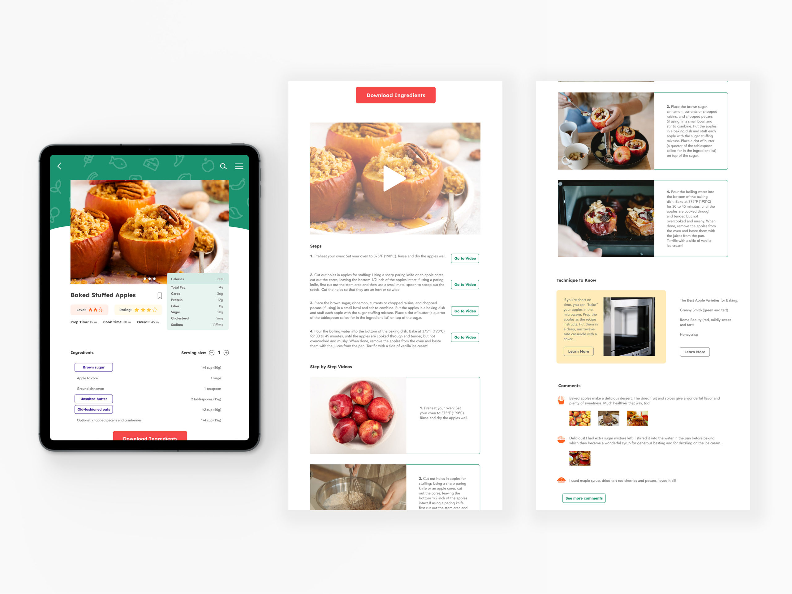
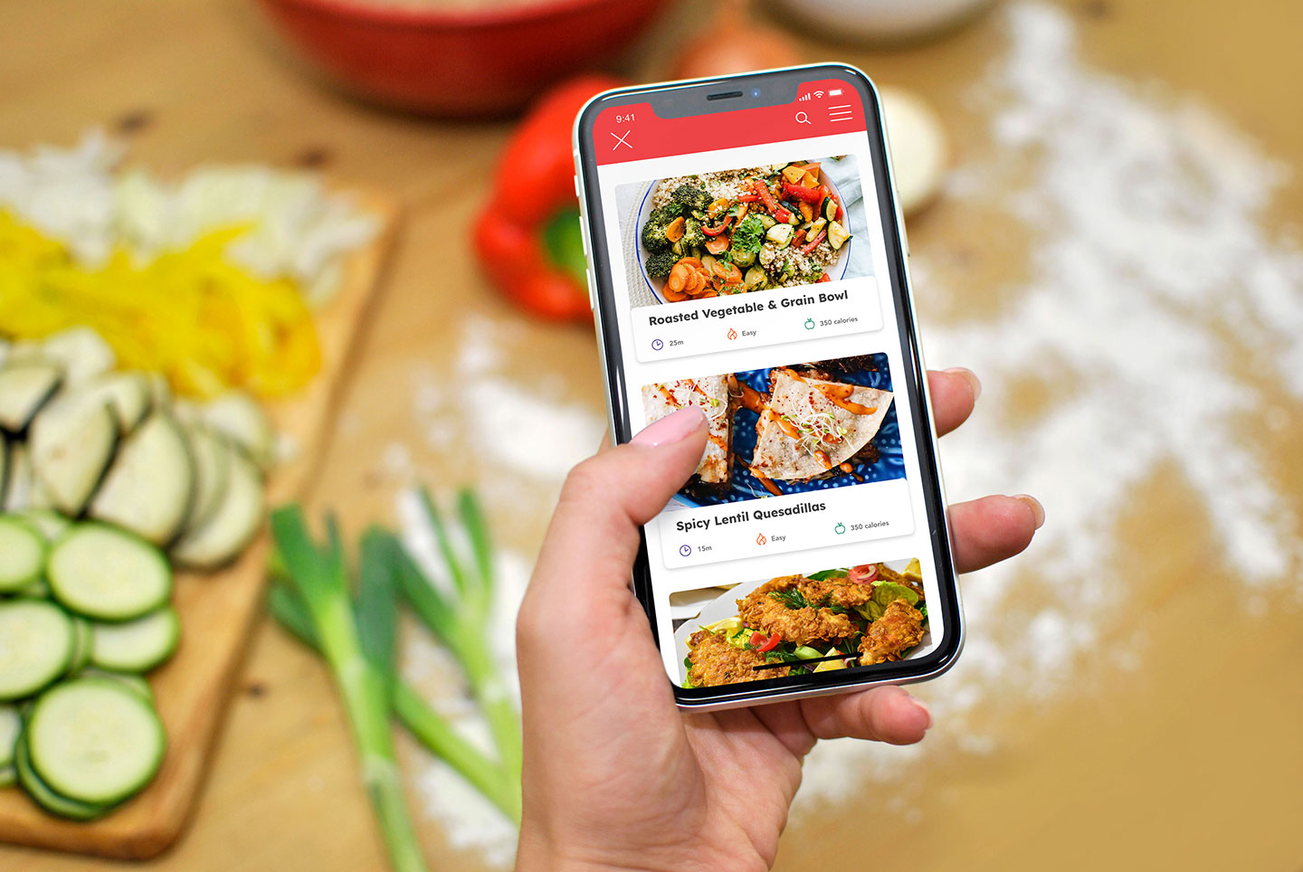
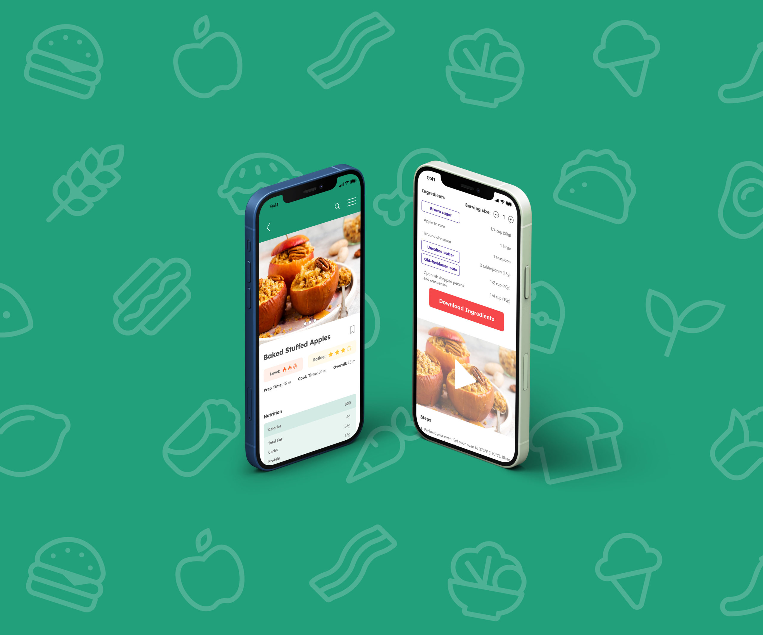
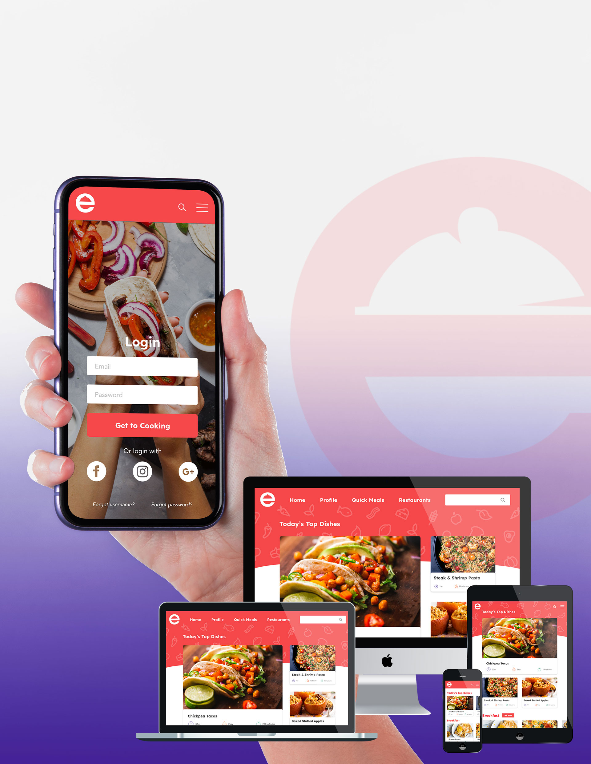
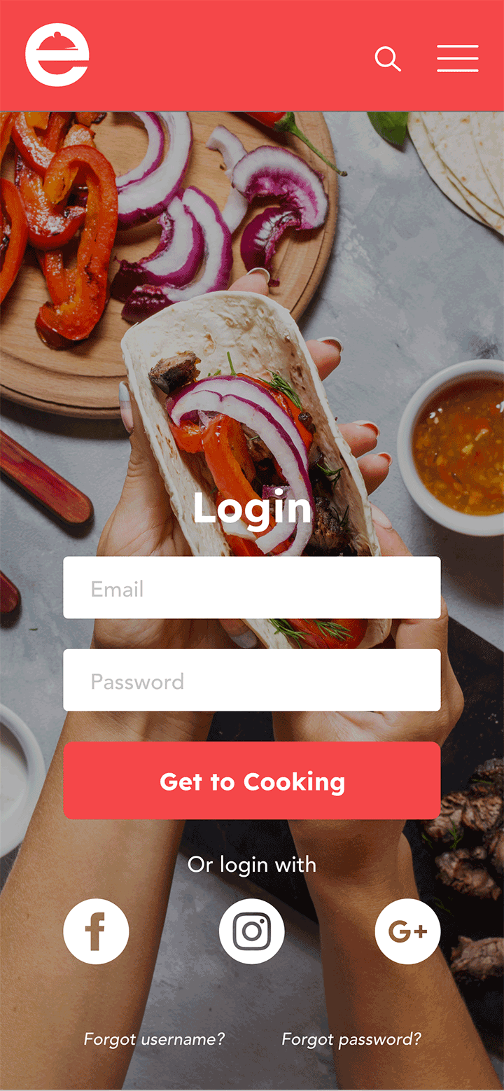
Ez Eats is a simple and fun website designed to make cooking a smooth process for users who don’t have much cooking experience without the distraction and frustration of pop up ads or long blogs. It also allows users the chance to be able to filter their search or change some ingredients based on their dietary preference or health ambitions.


Problem
Life can become hectic and make it hard to create time to cook or know what to order at restaurants that fits the users lifestyle. Especially if users are new to cooking and don’t know where to start as well as how to create alternatives to cook to dietary needs or nutritional goals.

Solution
Ez Eats is a simple and fun website designed to make cooking a smooth process for users who don’t have much cooking experience without the distraction and frustration of pop up ads or long blogs. It also allows users the chance to be able to filter their search or change some ingredients based on their dietary preference or health ambitions.
Design Process

Discover
Interviews

Define
Jobs to Be Done
User Flows

Ideate
Rapid Prototype
Testing & Feedback
Low-Fidelity Wireframes
Mood Boards

Design
Preference Testing
Final Designs
Reflection
Mockups
Design Process

Discover
Competitive Analysis
Interviews

Define
Personas
Jobs to Be Done
User Flows

Ideate
Paper Wireframes
Rapid Prototype
Testing & Feedback
Low-Fidelity Wireframes
Mood Boards

Design
Style Guide
Preference Testing
Final Designs
Reflection
Mockups
Discover
Competitive Analysis
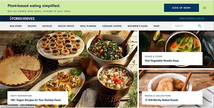
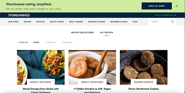
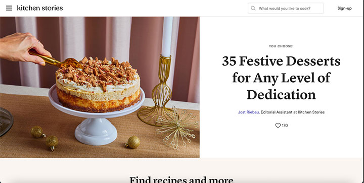
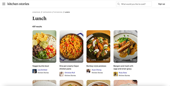
Researched to find two similar web responsive applications, Forks Over Knives and Kitchen Stories. They both were a popular choice from users who cook and have certain attributes that pertains to the target audience with having a range of healthy recipes. Below includes their strengthes and weaknesses:



Interviews
Users would benefit from an app that tailors to their busy lifestyle or dietary restrictions that is easy and accessible so they can continue to thrive without sacrificing their health, getting frustrated with not knowing what to do with what they have or having limited time. Here is questions asked that referred to leading to this hypothesis:
1.
5.
2.
6.
3.
7.
4.
Interviews
Users would benefit from an app that tailors to their busy lifestyle or dietary restrictions that is easy and accessible so they can continue to thrive without sacrificing their health, getting frustrated with not knowing what to do with what they have or having limited time. Here is questions asked that referred to leading to this hypothesis:
1.
2.
3.
4.
5.
6.
7.
Define
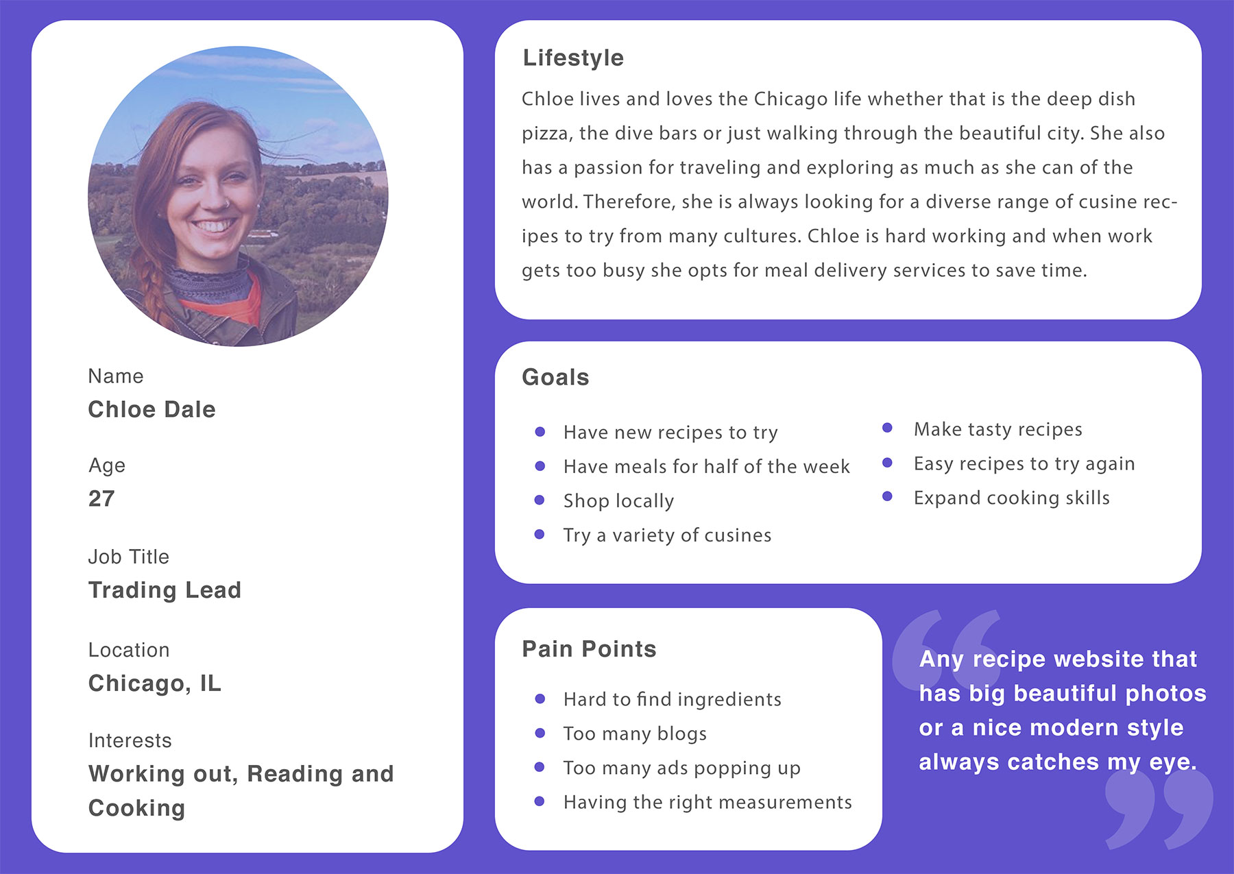
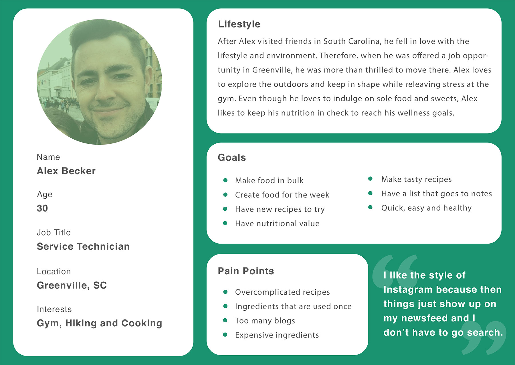
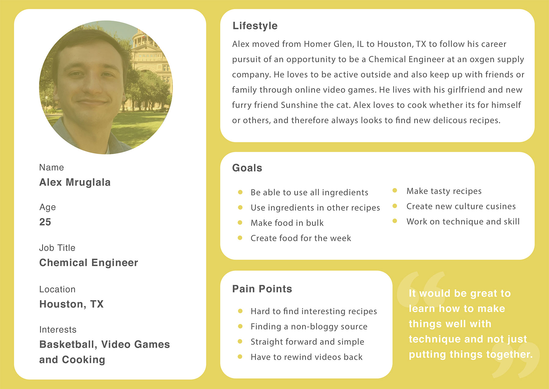
Personas
Jobs to Be Done


Jobs to Be Done


Features from JTBD



Create with stocked ingredients


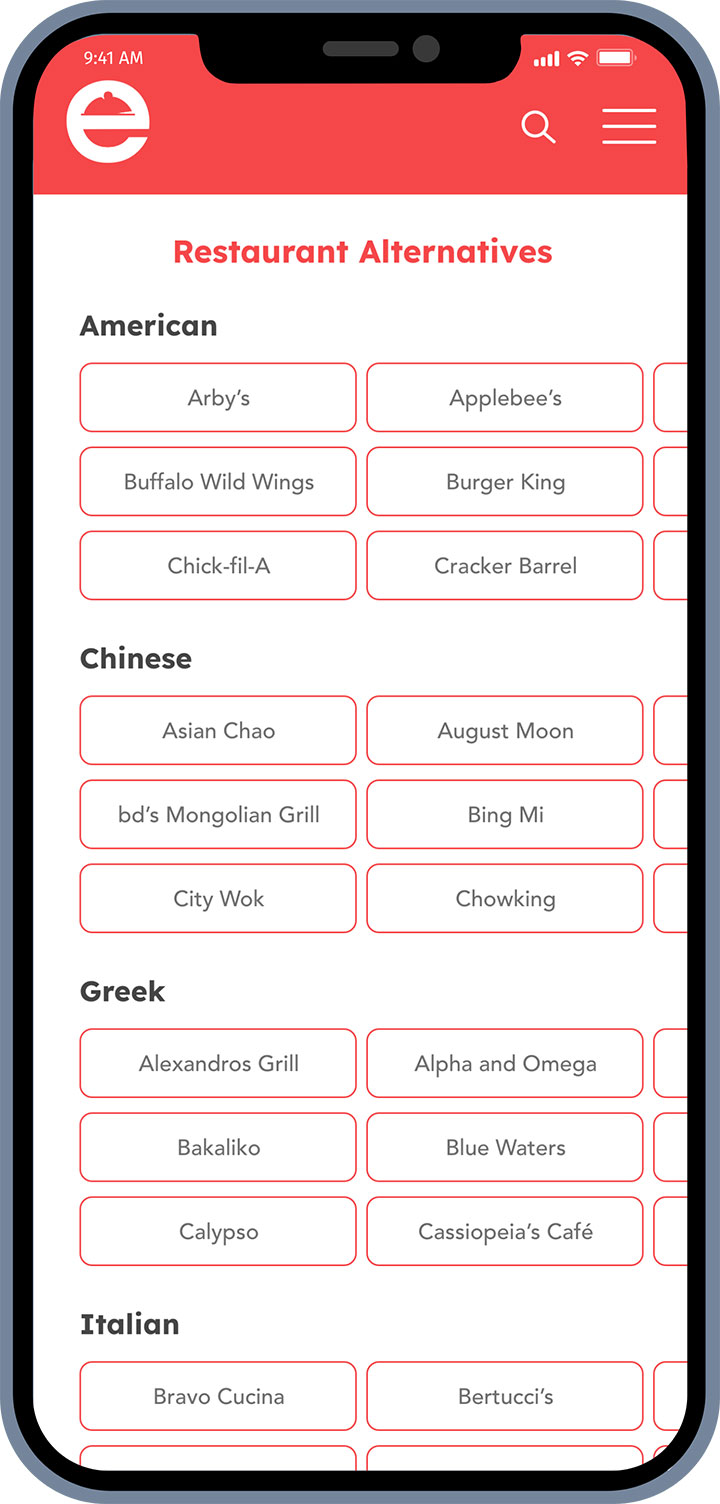
Alter fast food page


Optional notifications


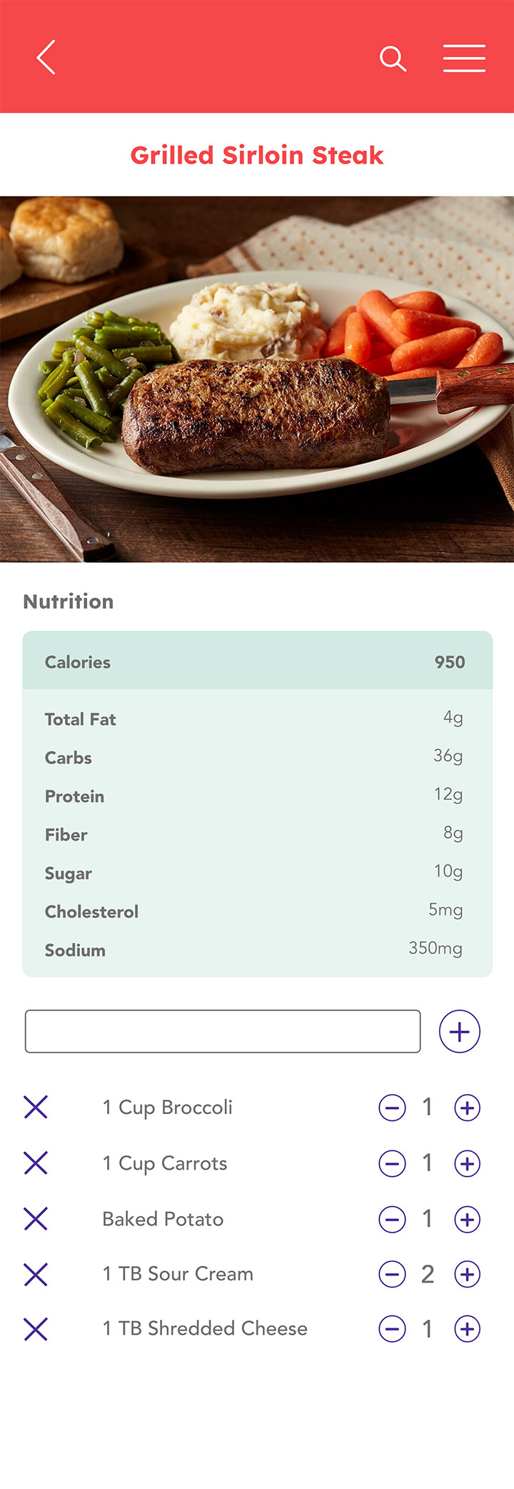
Alter serving size

Seasonal section


List that downloads to notes


Find ingredients based on location
Features from JTBD


User Flows

Ideate
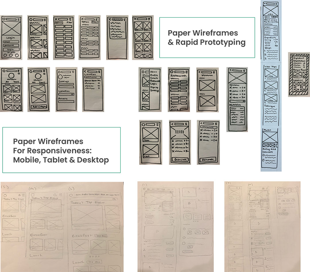
Prototyping
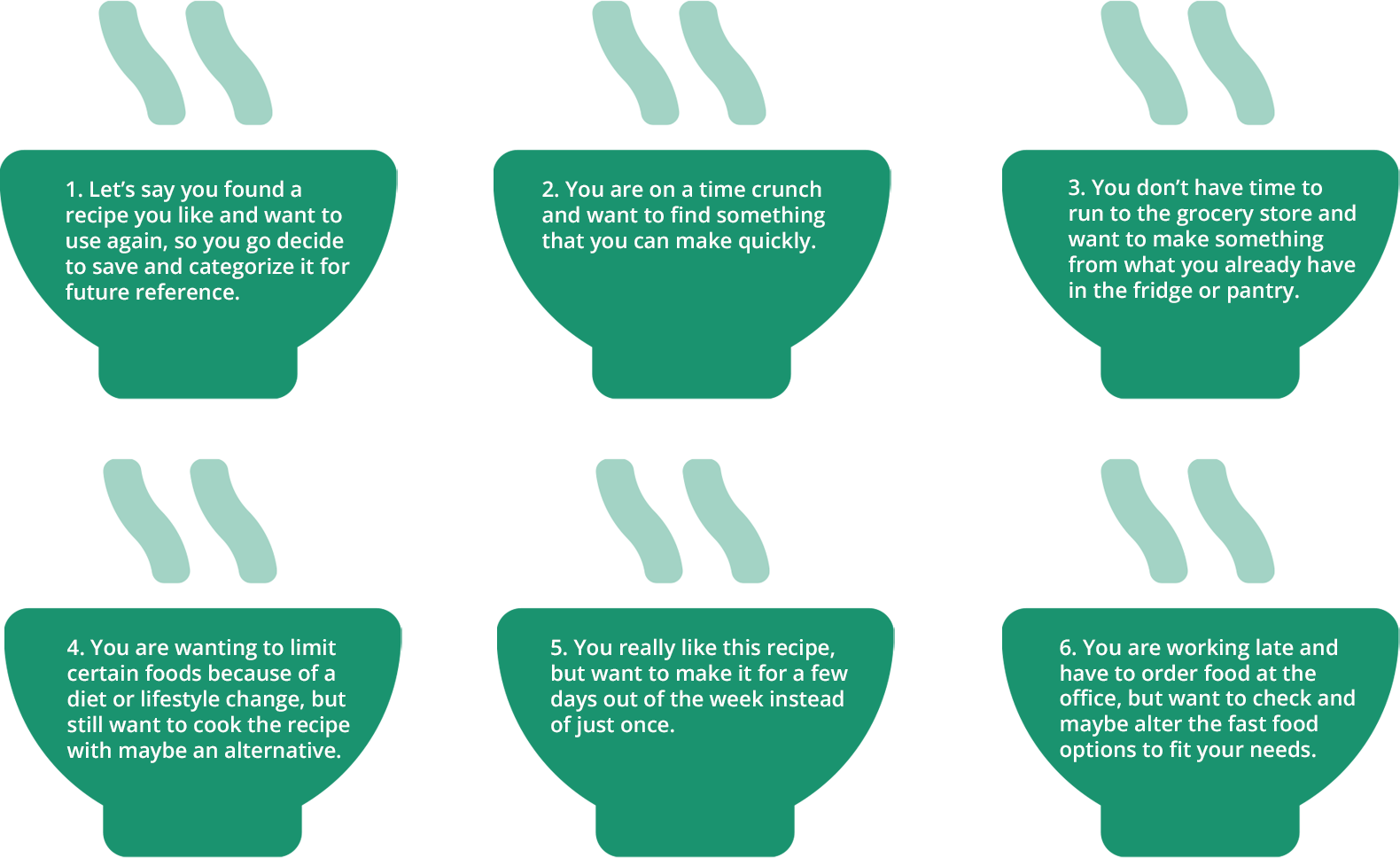
User Testing Tasks
From the intial phase of sketches and going through some quick iterations, rapid prototype was created and moved forth with testing it on potential users who fit the target audience range. These participants were given six scenerio tasks in order to oberve, gain feedback and conduct rating errors.
Results & Suggested Changes
Overall good feedback on the current features that were on the prototype, but much needs to be improved after the first phase of testing in order to hit pain points that participants had to prevent any further user frustration that could lead to usability catastrophe. Here are suggested changes based on observation and communication with participants:
- Have different verbiage for the name or having it stand out better. Name could be: Quick Meals, Use What You Have, Pantry Meals, Quick and Already Stocked. Having it maybe under when you click on the search bar.
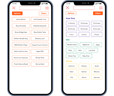
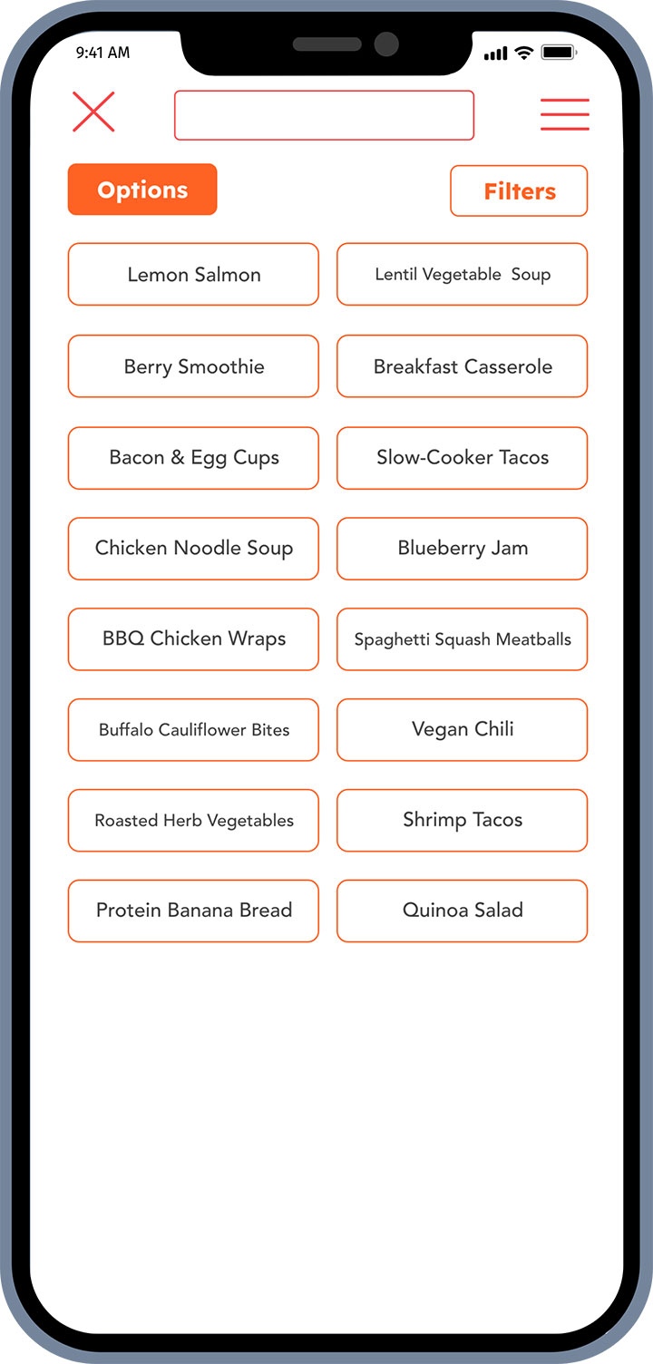
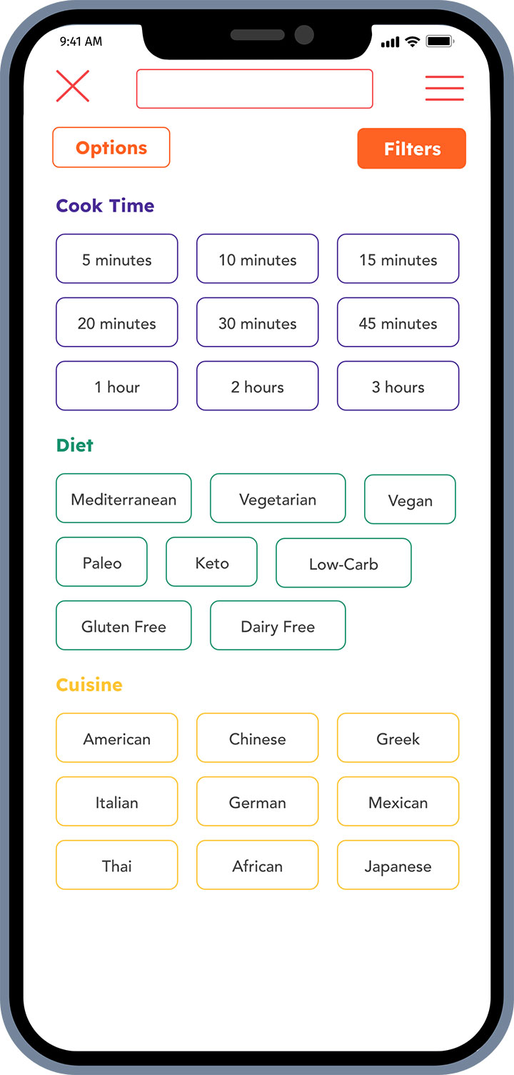
- Have the option to choose more than one in filters.
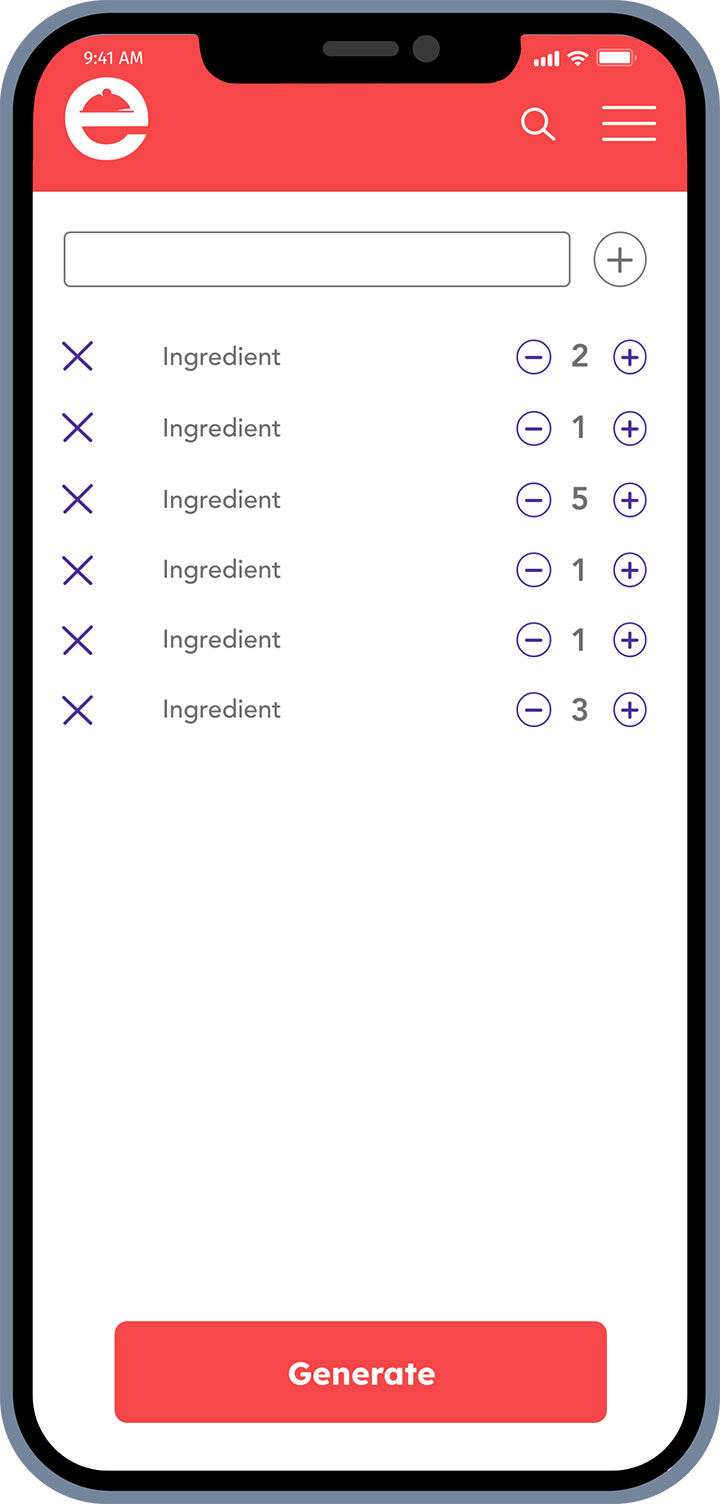
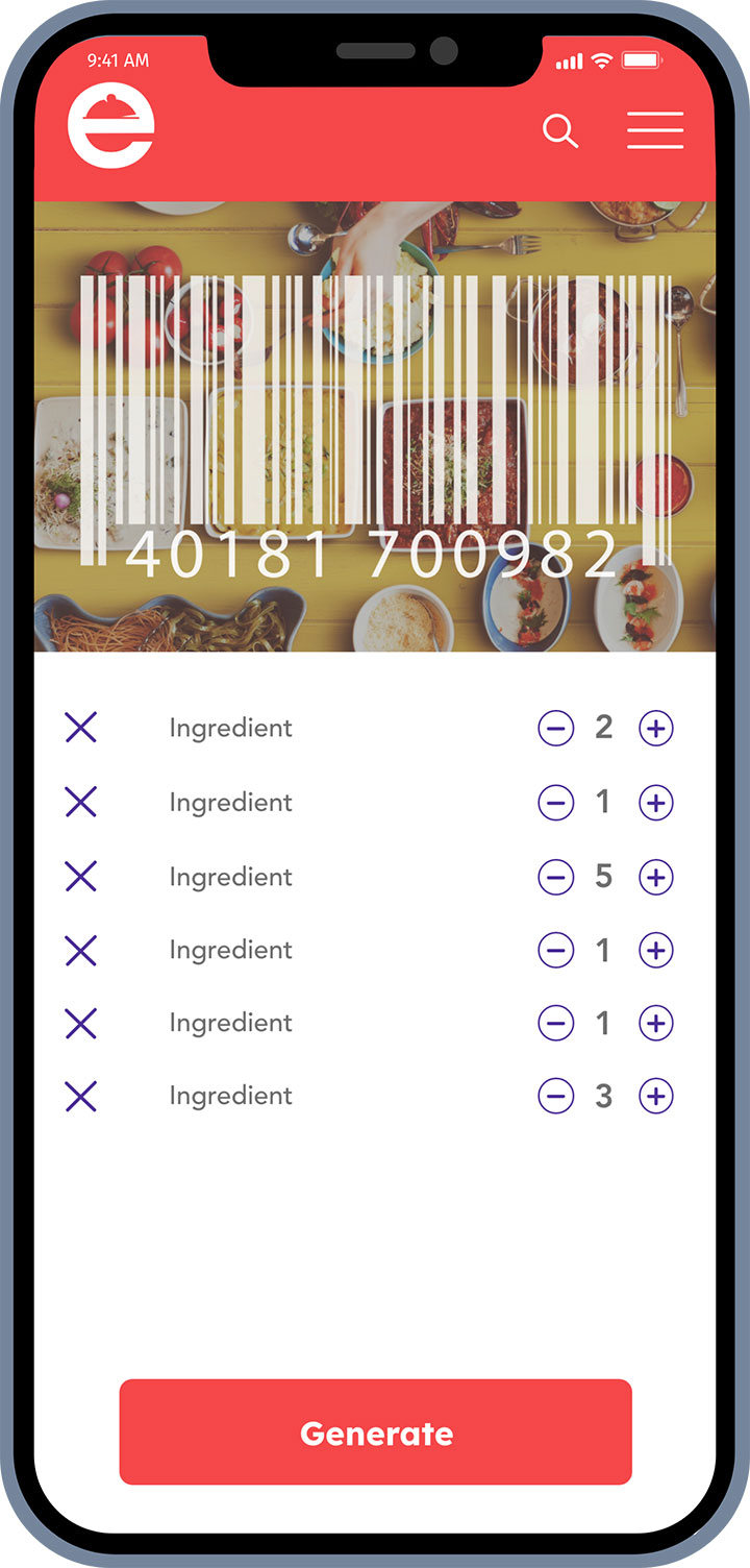
- Generate a range of meals to create. Make it so that the ingredients are all used up whether that is on one meal or a range. Or have another button that generates more than one meal and one that is for one recipe.
- Have the ingredient be bolded or as a button. Could also have button next to the ingredient.
- Add a search bar/drop down for users to add their own ingredient substitution in the ingredient pop up.
- Have better verbiage: Ingredient also found within these recipes.
- Have the photos be before or just after the main video along with the rating.
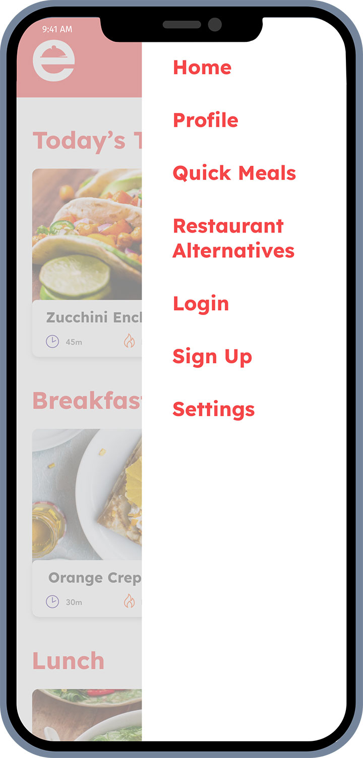
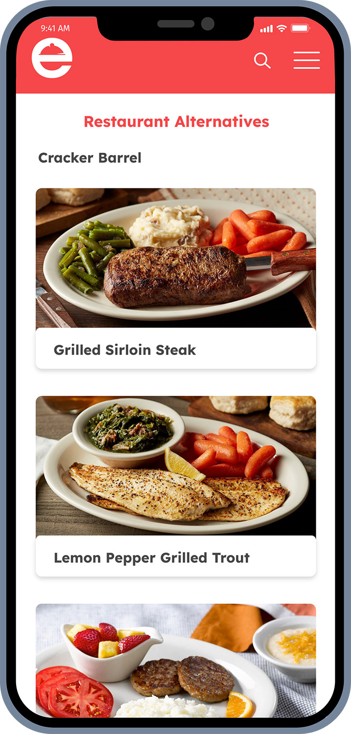
- Have the verbiage be different: Fast Food Options, Restaurant Options, Fast Food Alternatives. Have a call out maybe stating about the feature.
- Have a check off button next to each ingredient.
- Have the option of a button or section within the Create section.
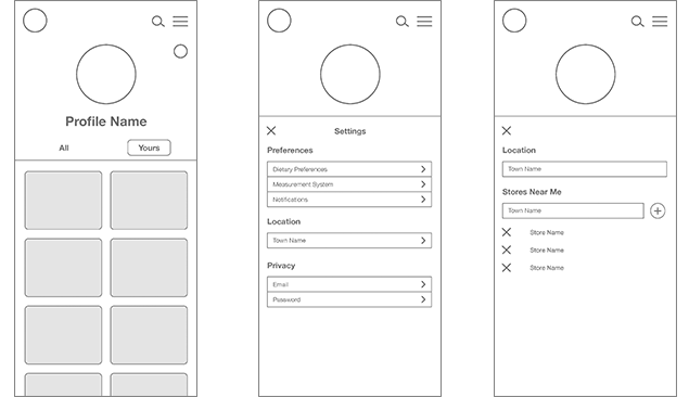
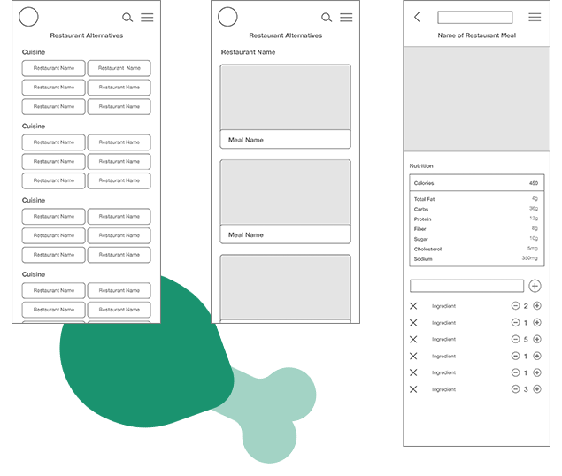
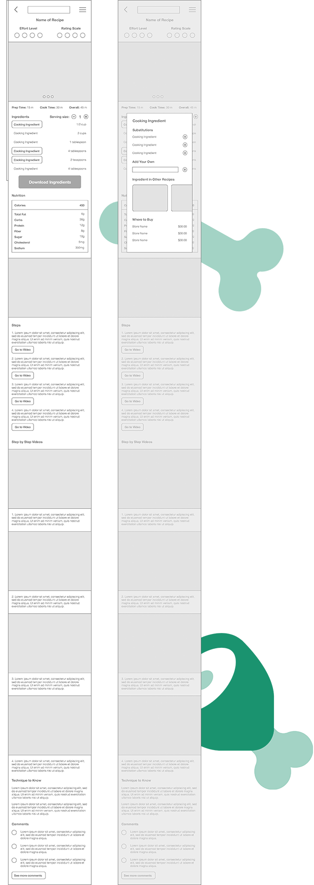
Low-Fidelity Wireframes
Mood Boards
Mood Board 1
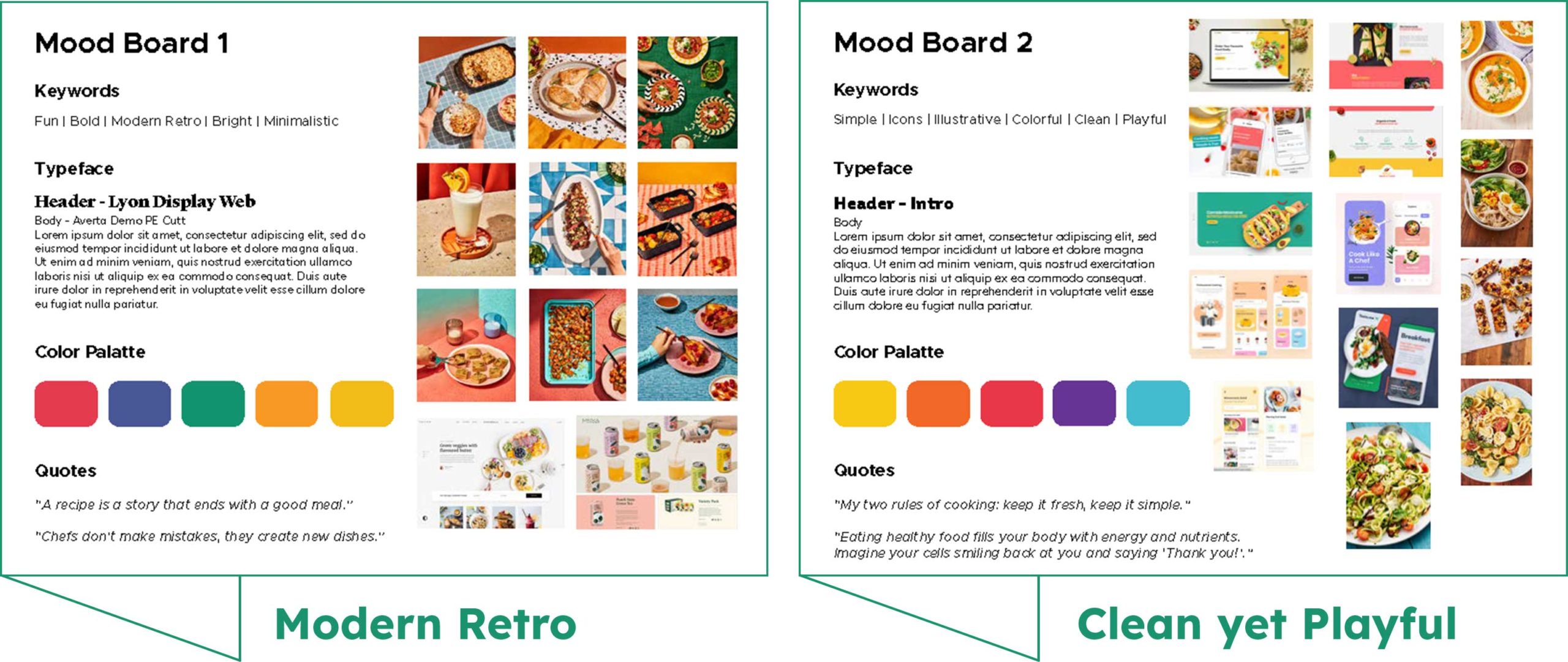
This mood board is inspired by a modern retro style that creates fun photos to not only display the food, but have a eye catching set up and background. Within the keywords, in aims to create an adventurous, but nostalgic style. The color palette is warming and fun to add a pop of bold color. The quotes show that cooking is to be a part of life that comes with failures to make new successes. It has a more vintage and almost gourmet feel to the overall board.
Mood Board 2
This mood board’s inspiration to be from the keywords, playful, yet simple and easy to recognize. It uses brightly colored photos to show beautiful display of the meal. It evokes a positive emotion to be fun and welcoming to new and experienced chefs. The color palette brings bright colors to be lively and joyful. The quotes explain that cooking doesn’t have to be complicated and healthy food can be enjoyable. It overall has a more vibrant and witty vibe.
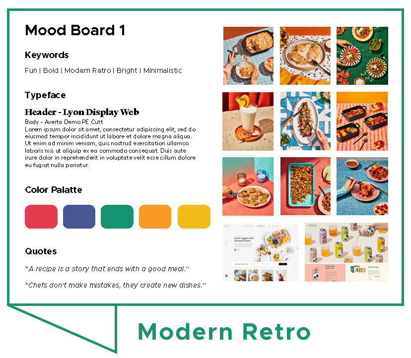
Mood Board 1
This mood board is inspired by a modern retro style that creates fun photos to not only display the food, but have a eye catching set up and background. Within the keywords, in aims to create an adventurous, but nostalgic style. The color palette is warming and fun to add a pop of bold color. The quotes show that cooking is to be a part of life that comes with failures to make new successes. It has a more vintage and almost gourmet feel to the overall board.
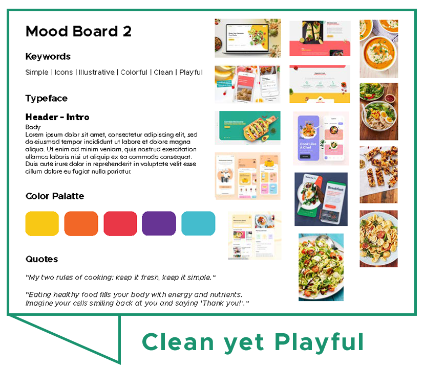
Mood Board 2
This mood board’s inspiration to be from the keywords, playful, yet simple and easy to recognize. It uses brightly colored photos to show beautiful display of the meal. It evokes a positive emotion to be fun and welcoming to new and experienced chefs. The color palette brings bright colors to be lively and joyful. The quotes explain that cooking doesn’t have to be complicated and healthy food can be enjoyable. It overall has a more vibrant and witty vibe.
Decision
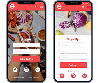
After working on mood board 1, I was starting to fall in love with the style and photo displays to use. However, after reviewing over the MVP, personas/interviews and the overall goal of this app for the users, I believe that mood board 2 would be more efficient in what the users need. I overall like both the mood boards that I created, I just liked the style of mood board 1 a little more, but knowing that I need to put my bias aside- mood board 2 would be better for the targeted audience. Mood board 1 seems more sophisticated style that may give the impression that this would be more suited for skilled or mastered users in cooking, which could lead away users new to cooking. Mood board 2 gives a feeling of being fun and open to all experiences with it’s bright colors and photography, yet simple and clean design. The second board also allows to be straightforward and remember to be easy for the dietary and healthy goals of the users.
Design
Style Guide

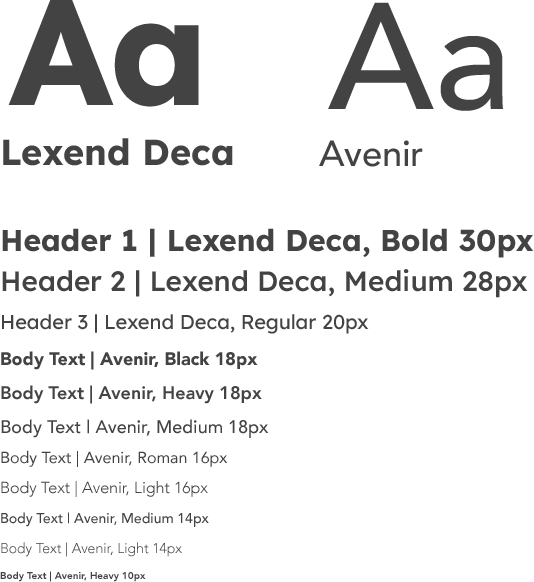


Tone
Witty | Joyful | Supportive | Lively | Enthusiastic
Style
Simple | Light | Clean | Bright | Playful


Preference Testing
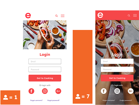
Questions asked after the test:

Final Designs
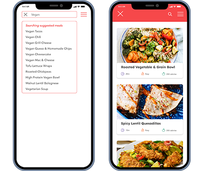
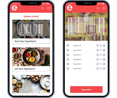
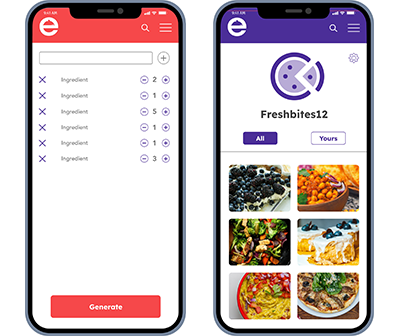
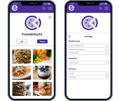
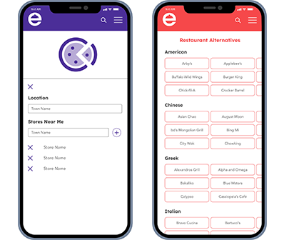
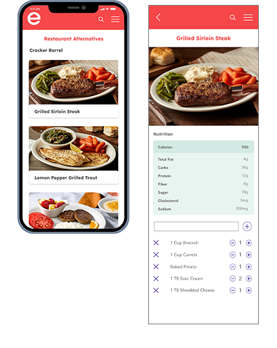

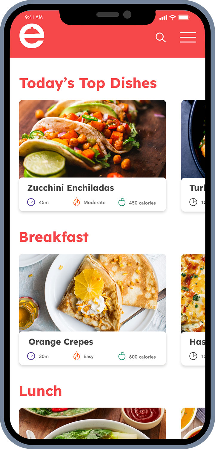
Final Designs
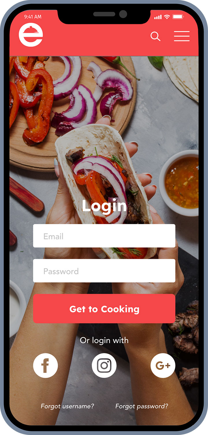
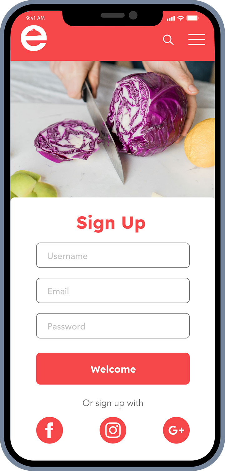
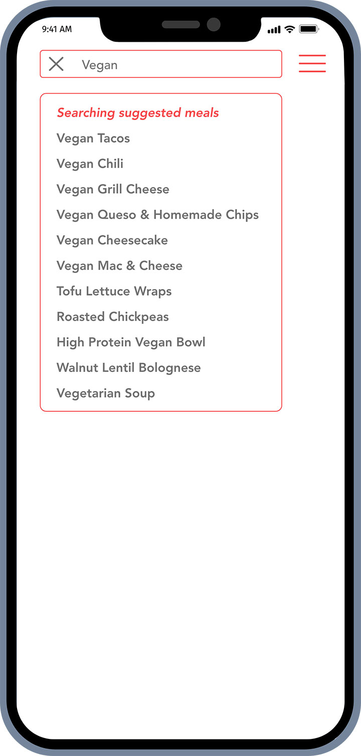


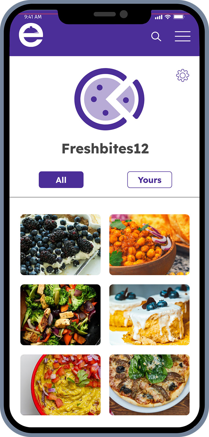
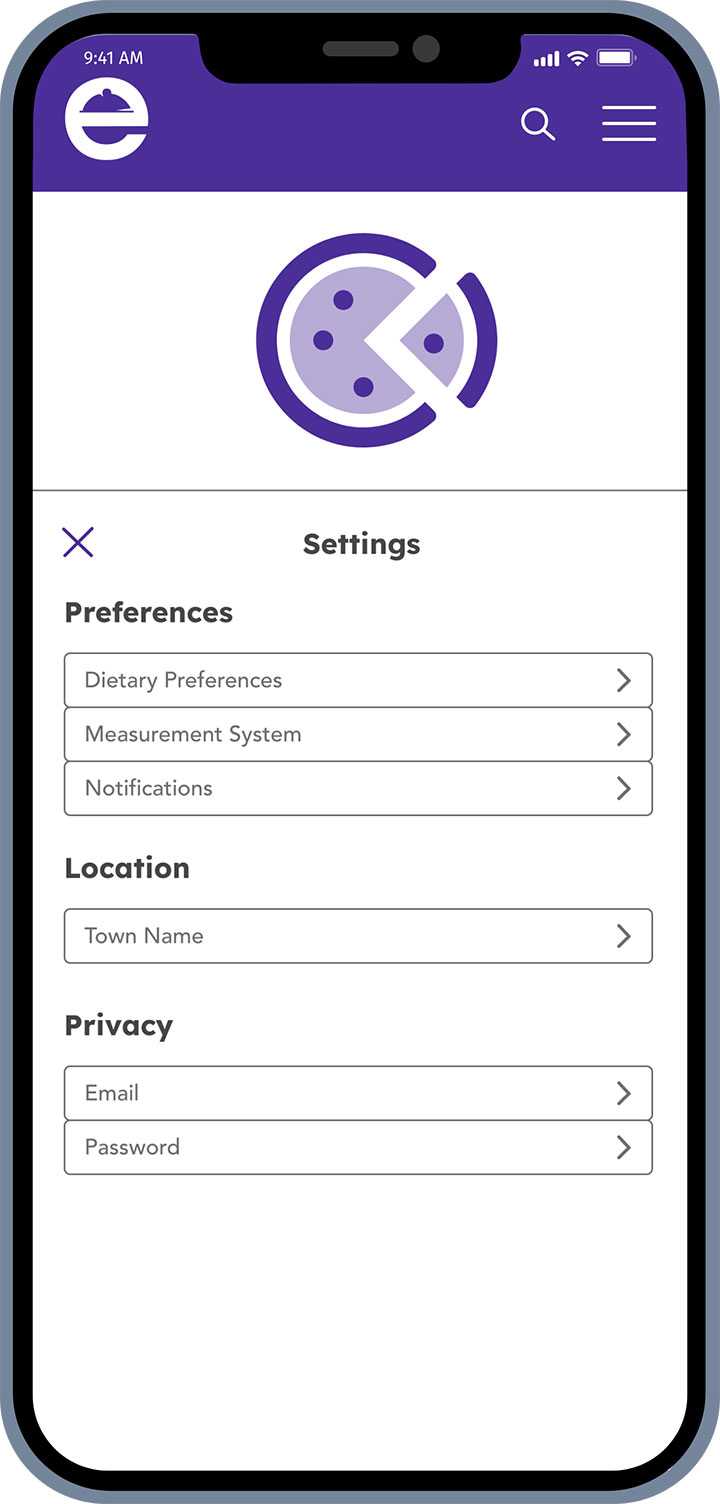
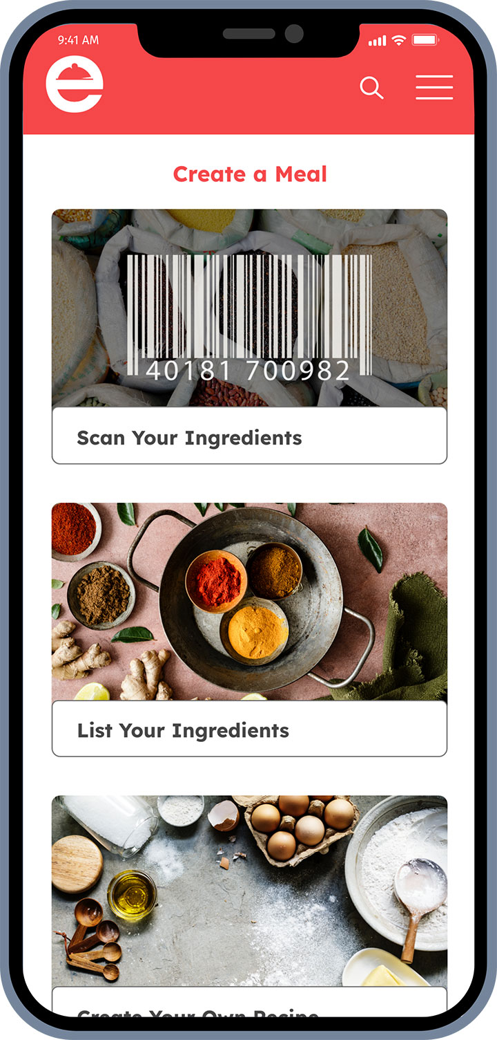
Final Takeaway
Retrospective – User Testing
What went well?
The user testing feedback was notable on the simplicity of the design as well as certain features like creating a meal from stocked pantry, being able to change the ingredients and the serving size.
User’s gave a positive experience, but also helped with inspiration and ideas because they overall liked the concept of the recipe web application.
What didn’t go well?
In the beginning of user testing, the participants were a little flustered with the first task because they were fresh to the web application since they have not used it before. Therefore, a few mistakes were made and some edits to the start of the test needed to be added for the next participant.
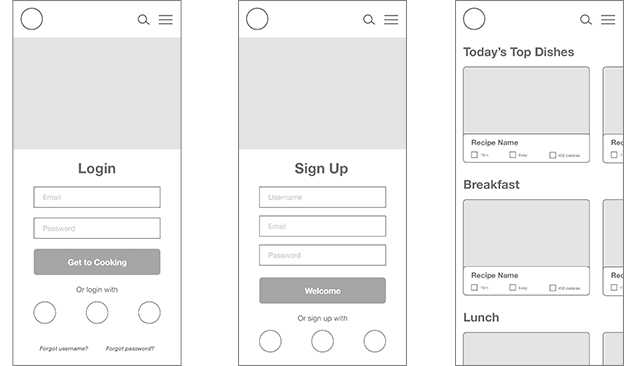
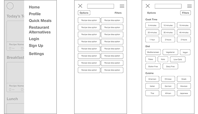
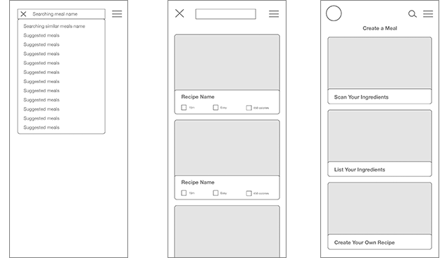
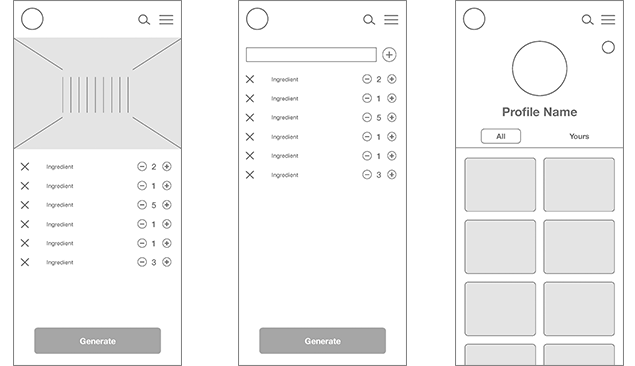
Within the prototype, since it is a low-fidelity wireframe, some of the words were just scribbles, thinking they would be irrelevant to the test. This became clear from questions and comments that the users would be able to reach their goals if there was a little more detail the the wireframes.
What can be improved?
Through testing and iteration, what can be improved for a better testing flow is to allow the users to play with the prototype first as if they were just browsing through a new website. This gives them a chance to see what is currently within the prototype without giving them any tasks, yet. Also, having a laid out starting point before the first task, such as having them pretend they already have a login or set up a profile.
Through hearing the frustration of not knowing what certain things are based on no written words in the wireframe, it would be best to give a little more detail espeacially putting in more verbaige to have a clear understanding what things are, even if they might not be relevant to the task.
Overall of Project
How did you interpret the project brief?
I interpreted the brief to do as best you can to emphasize with the users frustration faced with current recipe websites in order to excel expectations for a new website.
What roadblocks did you encounter as you worked on each deliverable (consider the ones curated for your portfolio case study)? How did you overcome these roadblocks?
I had a few roadblocks that I encountered such as during the testing sessions, at least in the beginning the participant was just tapping around trying to find where the active link was in order to move forward. I was able to overcome this issue through having a new script and plan for the next participants so the testing wasn’t skud. I also was having a creative block with the name, but after playing around with verbiage and finding logo inspiration as well as keeping the impression that this website is meant to be clean and easy, which helped create the name and logo.
What was your
role in this project?
I took many hats during this project from both the UX and UI designer which allowed me to get in depth with gathering information and carrying it into final polished designs.
Did you have to change direction at all? If so, why?
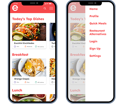
II did have some direction with certain features such as the Restaurant Alternatives page, making the name different to understand what this page would be for. I also had a different mood board in mind to be fun, but have a retro flare. But, after reviewing my board of inspiration and as much as I liked the style I realized I had to put my bias aside because that style might interpret a more professional cooking style that could be intimidating to users new to cooking.
What insights from your research and testing had the biggest impact on your final design?
The insights that had a big impact on final design was understanding the participants frustrations and verbal suggestions when testing them with the prototype.
If you could, what would you do differently?
I believe I would do some things a little differently such as having a better structure and starting point for the participants who were doing the testing because there was a little confusion and frustration for the first task and even just before starting the first task. I also would start to create a logo and name during the beginning of the designing process or when creating a mood board because that would also give a good guidance towards the style of the app.
