Process
Core Values

Ease

Gratitude

Joy
Core Values

Ease

Gratitude

Joy
Principles
Don’t get in the way:
The animations are kept to be simple and at minimum in order to keep an easy flow and not become a distraction and take away from the relaxation the user wants to absorb using mello.
Make it feel natural:
With this being a meditation app, creating a natural feeling when going through each screen is the main objective, therefore, the fade and ease-ins are used with transitions.
Set the Stage:
By having the modules on the screen fade in or ease in, there is a sequence in which they show up so that it sets up the screen and not interrupts the flow with showing everything at once.
Keep Continuity:
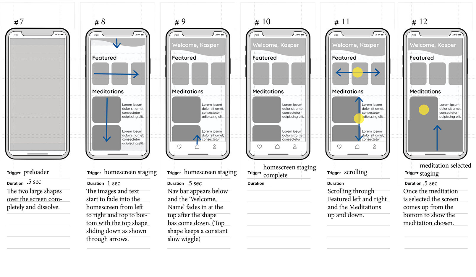
The animations are consistent when transitioning between screens and flow nicely with having modules fade in from left to right and bringing the navigation from the bottom up.
Keep Orientation:
As the user goes through the app the transitions are smooth and allow the user to know where they are going so there is not multiple animations at once that become overwhelming and hard to navigate.
Create Hierarchy:
This is achieved through the text, images and elements that come across the screen based on previous data of the user looking at more frequently as well as relevance.
Guide Attention:
Through having the navigation bar delayed in coming into the home screen it is the last for the user to view and be guided through the app.
Competitive Analysis
After understanding the core values and principles of mello to guide the animation process, a competitive analysis was done to review similar apps in order to be inspired along with what can be enhanced in mello’s design process.
Calm
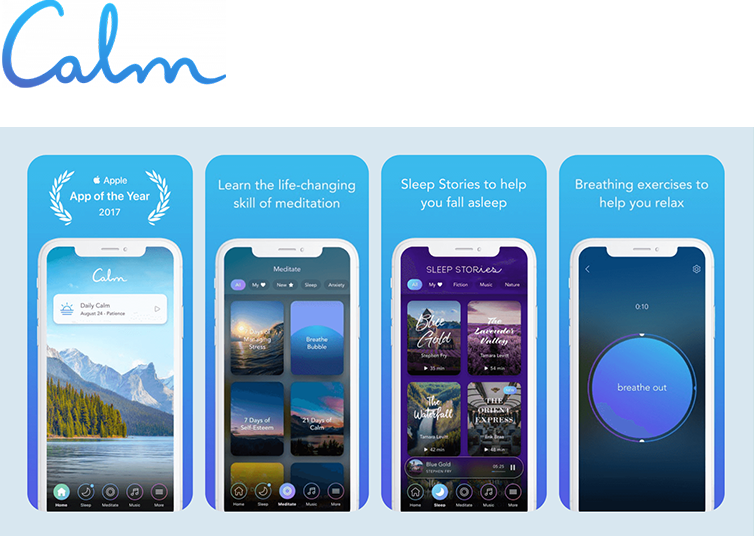
Right when opening the app Calm for the first time, it asks to take a deep breathe and then eases into the following screen that asks you to choose why you are brought to the app with simple buttons and a serene background. Calm introduces sound right away on the home page that is a soft noise of a water stream and birds chirping even through scrolling down further. I like how gentle the transitions are and the loading is quick to get you to where you need to be as well as the feeling of being guided as the example of the ball for breathing flows in and out.
Headspace
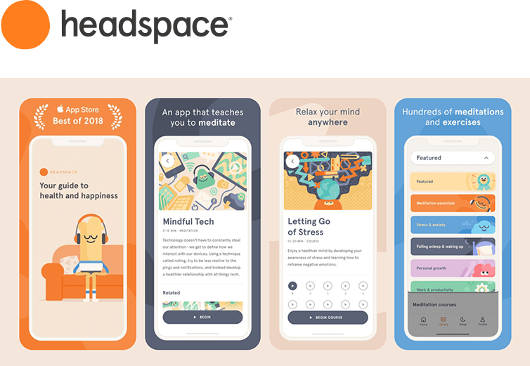
Within Headspace they create a welcoming and cheerful vibe that radiates happiness while having a clean layout with effortless transitions in their animations. I like that they have illustrations that guide the user in a friendly way while implementing smooth flows as you go through the app so they are pleasant, but not distracting.
Principles
Don’t get in the way:
The animations are kept to be simple and at minimum in order to keep an easy flow and not become a distraction and take away from the relaxation the user wants to absorb using mello.
Make it feel natural:
With this being a meditation app, creating a natural feeling when going through each screen is the main objective, therefore, the fade and ease-ins are used with transitions.
Set the Stage:
By having the modules on the screen fade in or ease in, there is a sequence in which they show up so that it sets up the screen and not interrupts the flow with showing everything at once.
Keep Continuity:
The animations are consistent when transitioning between screens and flow nicely with having modules fade in from left to right and bringing the navigation from the bottom up.
Keep Orientation:
As the user goes through the app the transitions are smooth and allow the user to know where they are going so there is not multiple animations at once that become overwhelming and hard to navigate.
Create Hierarchy:
This is achieved through the text, images and elements that come across the screen based on previous data of the user looking at more frequently as well as relevance.
Guide Attention:
Through having the navigation bar delayed in coming into the home screen it is the last for the user to view and be guided through the app.
Competitive Analysis
After understanding the core values and principles of mello to guide the animation process, a competitive analysis was done to review similar apps in order to be inspired along with what can be enhanced in mello’s design process.

Calm
Right when opening the app Calm for the first time, it asks to take a deep breathe and then eases into the following screen that asks you to choose why you are brought to the app with simple buttons and a serene background. Calm introduces sound right away on the home page that is a soft noise of a water stream and birds chirping even through scrolling down further. I like how gentle the transitions are and the loading is quick to get you to where you need to be as well as the feeling of being guided as the example of the ball for breathing flows in and out.

Headspace
Within Headspace they create a welcoming and cheerful vibe that radiates happiness while having a clean layout with effortless transitions in their animations. I like that they have illustrations that guide the user in a friendly way while implementing smooth flows as you go through the app so they are pleasant, but not distracting.
Style Guide
Reflecting on mello’s core values, the style guide focuses on a warm and joyful welcoming to manifest growth or a tranquil journey for users.
Typography

Logo

Color Palette
Wireframes
UX Designer’s Wireframes
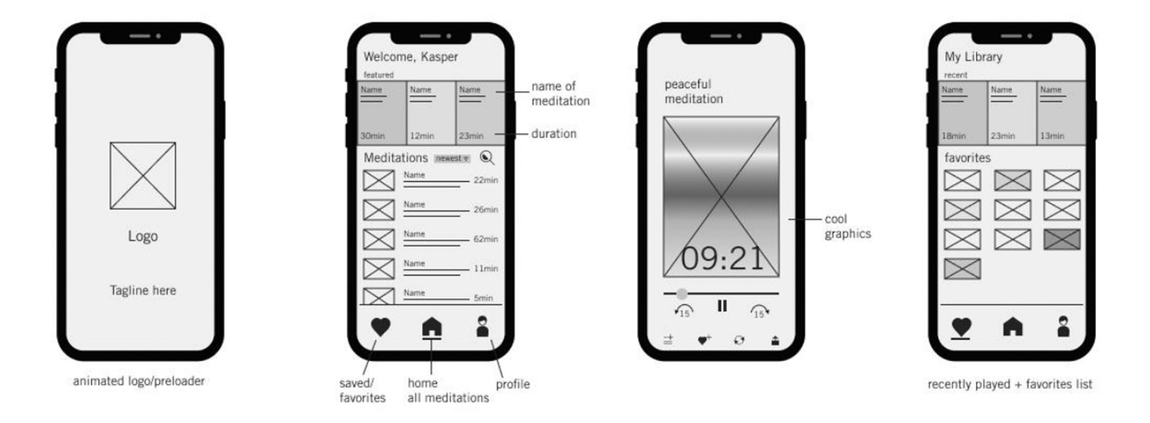
Designed High-Fideliety Wireframes

Storyboards
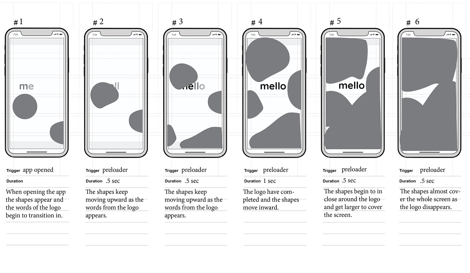
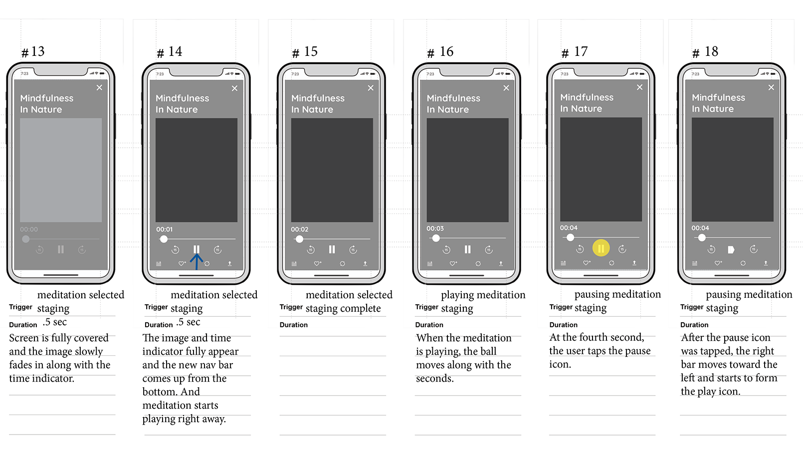
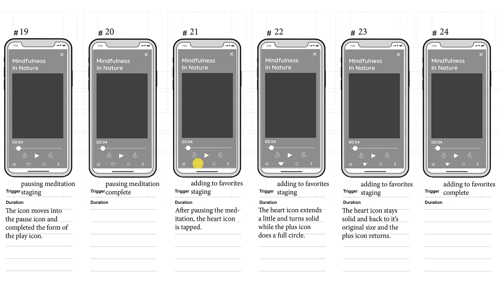
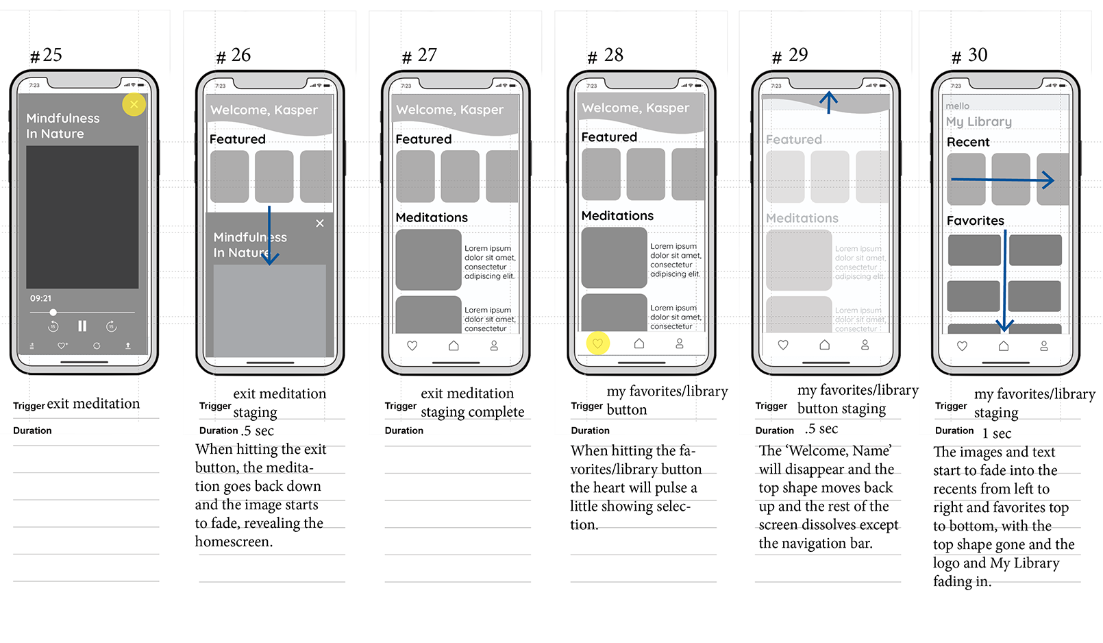
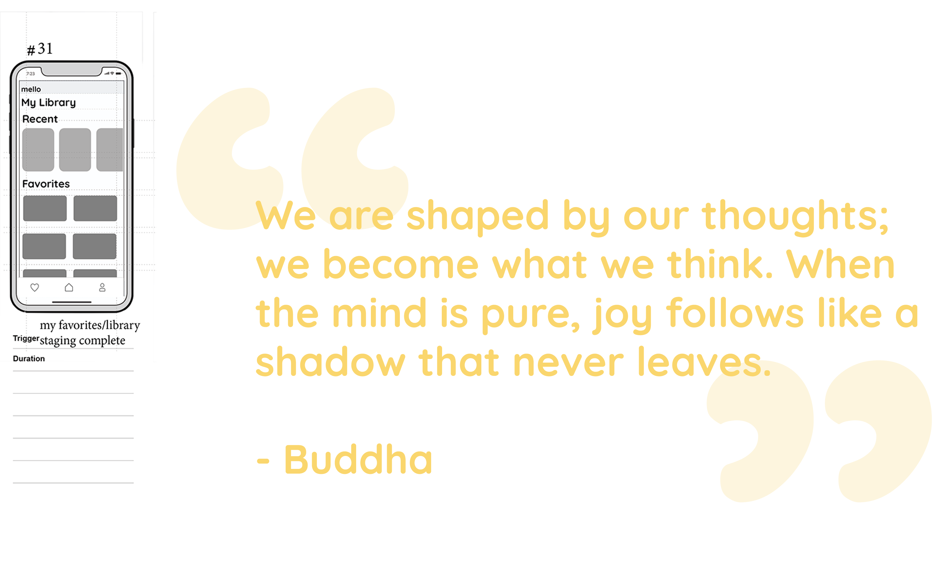
After designing finished high-fidelity wireframes, the storyboard process went through two iterations in order to match the values of the brand to be easing into the app and give off a nice flow that doesn’t get in the way of the user.
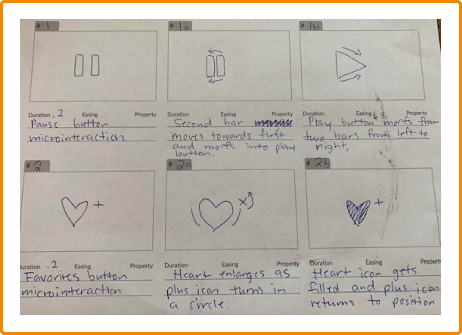
Microinteractions
Final Takeaway

Overall
This project allowed me to explore the stages of animation and what is needed to implement not just during the creation of the animation, but the approach before with storyboards to share to your team. I was able to establish techniques within After Effects and understand the importance of microinteractions as well as how they play to the overall feel of the app. I also learned more on the principles of animation and how crucial it is that the animation does not get in the way of the user along with remembering that it should reflect back on the core values of the brand.

Change for the Future
Even though I am happy with how the designs and the animation turned out for mello, there are a few things I would have done a little differently to enhance the process of creating the app. I think having the understanding that the pre-loader was meant to look like a lava lamp for a nice flow, I would have created more depth to the background or maybe with the shapes. I think also having more of the shapes morphing and colliding into each other to slow down the pre-loader a little bit would give it a nice ease in. My only other change would be to either review in my storyboard beforehand about slowing down the starting of the meditation when the user clicks on it by maybe having the timer go a little longer.
Challenge
I am proud at how much I was able to learn about After Effects through creating mello, however, there is still a lot to master. Therefore, I think adding expressions was more of a challenge for me in understanding how in depth they can be or the right time to use them. I was able to review how important expressions can be, especially when creating a lot of animations or repetitions of them. I even went out of my comfort zone after playing around with them and incorporated a few expressions within mello’s animation.


