Overview
Ever wanted to plan an adventure, but didn’t know where to start or what details go into structuring the ideal trip? My Map takes the hassle out of jumping from multiple browser tabs or separate accommodating apps and narrows down to one spot that allows an easy, but exciting way of planning a trip. Type in your next destination and be able to add key features such as creating an itinerary, reviewing and adding transportation, find the best lodging, create a budget and be able to split costs with friends, and of course a packing list to make sure you don’t forget that extra phone charger. Be able to roam this planet whether that is on a solo retreat or invite friends who can add to the adventure, and have My Map take the stress out of planning which allows you to focus on the journey ahead!
Problem
Planning a trip may cause stress and users find themselves searching for their next travel plans through multiple apps or searching within different websites. This can be intimidating and make users think twice about going forward with taking a vacation because the process is overwhelming.
Solution
My Map brings together the main components of planning a trip into one app making it easy to access all the information the user needs to add and adjust. The app gives users the chance to personalize the details and even have the option to add friends who can also edit the same trip making it simple to view what costs need to be split as well as having fun building the next adventure.
Design Process
Design Process
Competitive Analysis

Mapify

Wanderlog

Tripscout
Competitive Analysis

Mapify
Mapify sets out to bring inspiration to travel through having a gallery section to open and see more details about where the photo was taken. It provides a map with small icons of where the user has traveled to.

Wanderlog
Wanderlog creates an easy and clean design style to follow, while also including a trip itinerary to add, travel and stay information, and any other attachments needed.

Tripscout
Tripscout allows users to dive into the app without having to login or create an account. The modern layout is styled nicely with balanced out white space for the eye to be captured by the photos and typography.
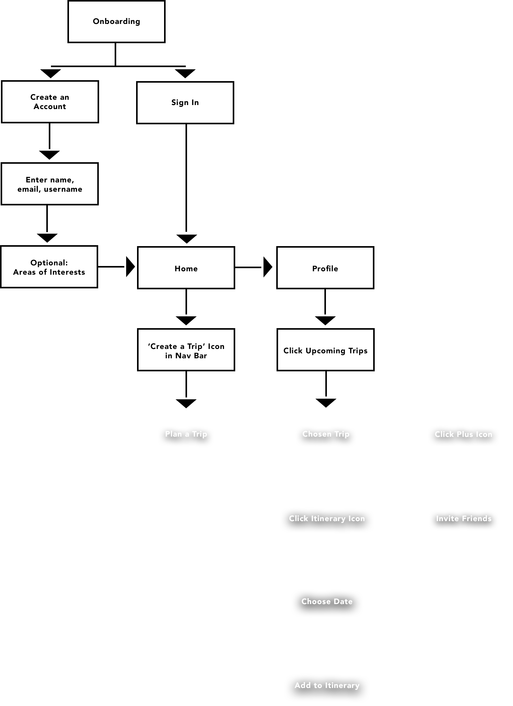
User Flows
Low Fidelity Wireframes
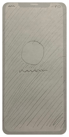
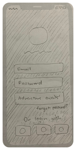
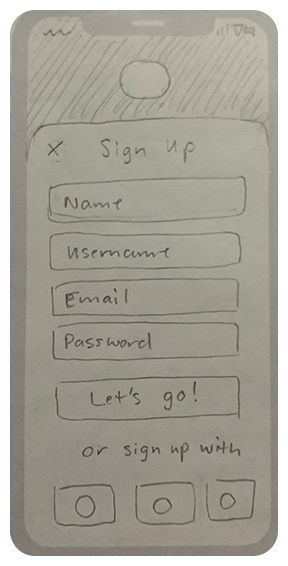
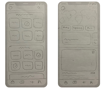
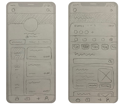
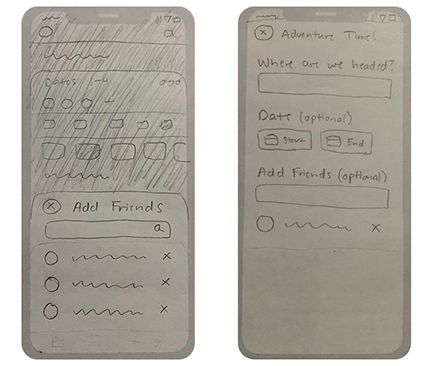
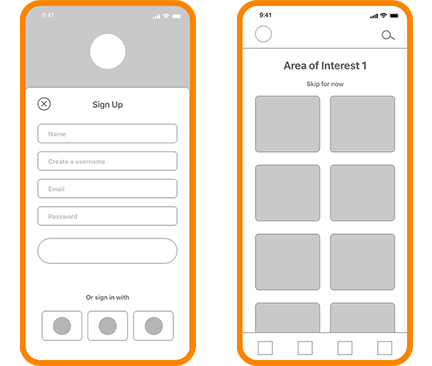
From the user flows I started sketching low fidelity paper wireframes because I knew there was going to be a few iterations before starting the layout in Adobe XD.
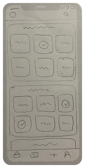

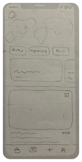
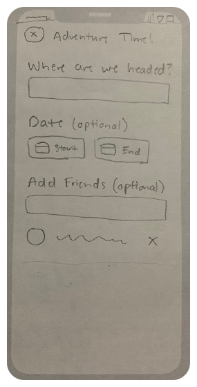
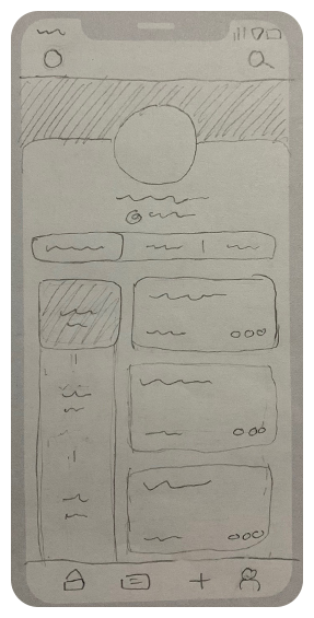
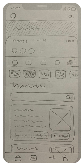
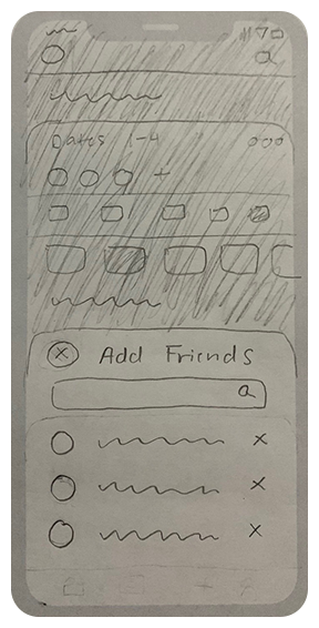
Low Fidelity Wireframes
From the user flows I started sketching low fidelity paper wireframes because I knew there was going to be a few iterations before starting the layout in Adobe XD.
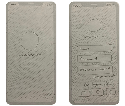
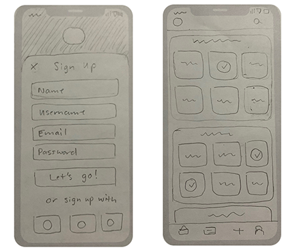
Mid Fidelity Wireframes
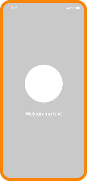
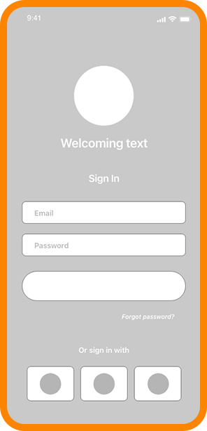
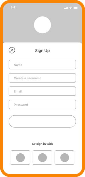
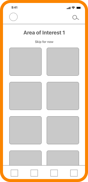
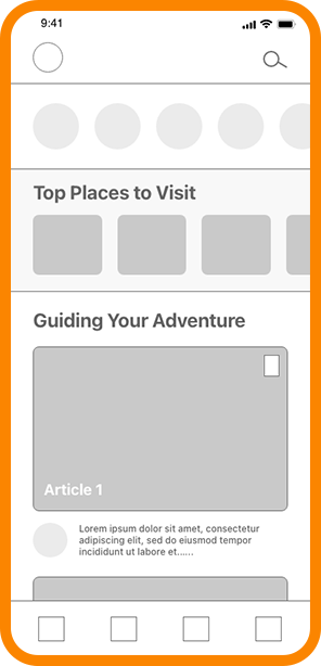
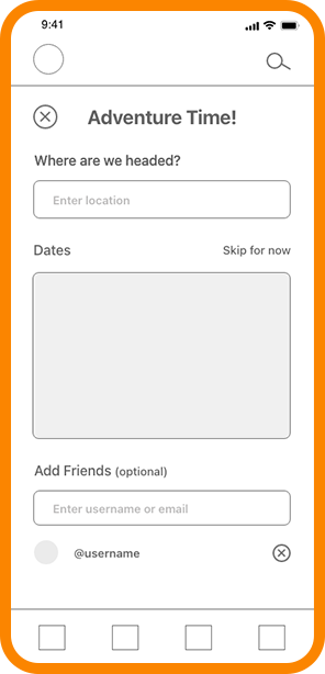
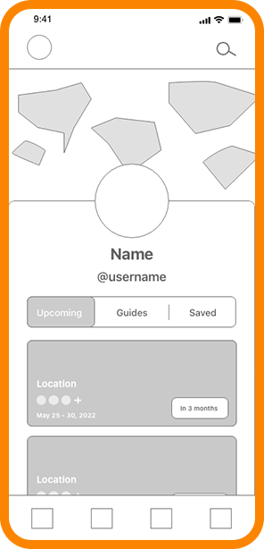
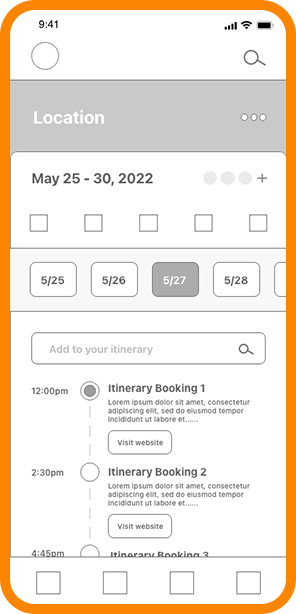
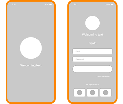
After going through the process of sketching paper wireframes, I developed the beginning stages of mid fidelity wireframes and made edits or changes for a better flow.


Mid Fidelity Wireframes
After going through the process of sketching paper wireframes, I developed the beginning stages of mid fidelity wireframes and made edits or changes for a better flow.
Brainstorm Inspiration
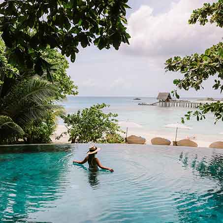
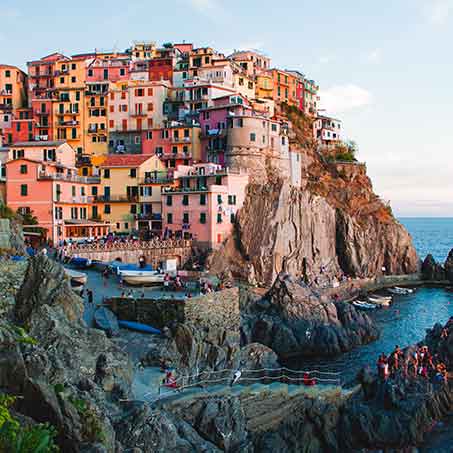
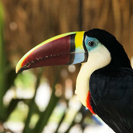
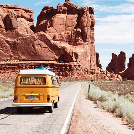
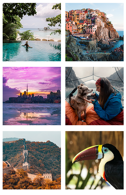
The look and feel of how My Map should be presented with a fun and exciting tone, but simple enough to focus on the user’s experience through inspirational photos.
Keywords
Fun | Inspiring | Adventure | Escape | Wonder
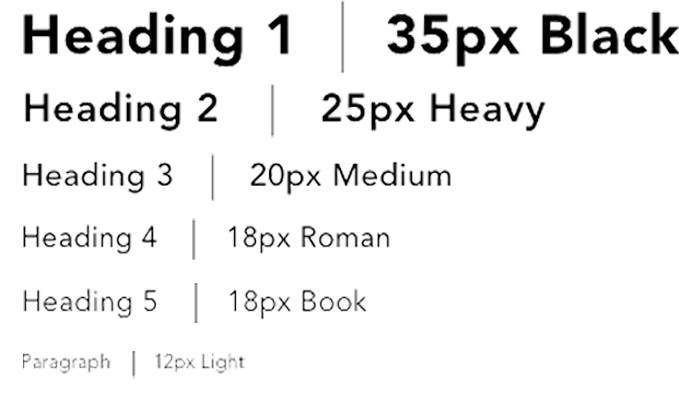
Typography

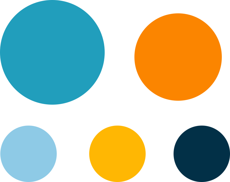
Color Palette



“Oh, the
places you’ll go!”
– Dr. Seuss
Brainstorm Inspiration
The look and feel of how My Map should be presented with a fun and exciting tone, but simple enough to focus on the user’s experience through inspirational photos.
Keywords
Fun | Inspiring | Adventure | Escape | Wonder
Typography


Color Palette

Imagery
“Oh, the
places you’ll go!”
– Dr. Seuss

Final Designs
After reviewing over ideas and gaining momentum from inspiration, the color palette, photos and icons were initiated to bring alive the next adventure! There were a few drafts and after testing, these presented high fidelity wireframes incorporate user feedback in order to become a better experience for the user.
Sign In
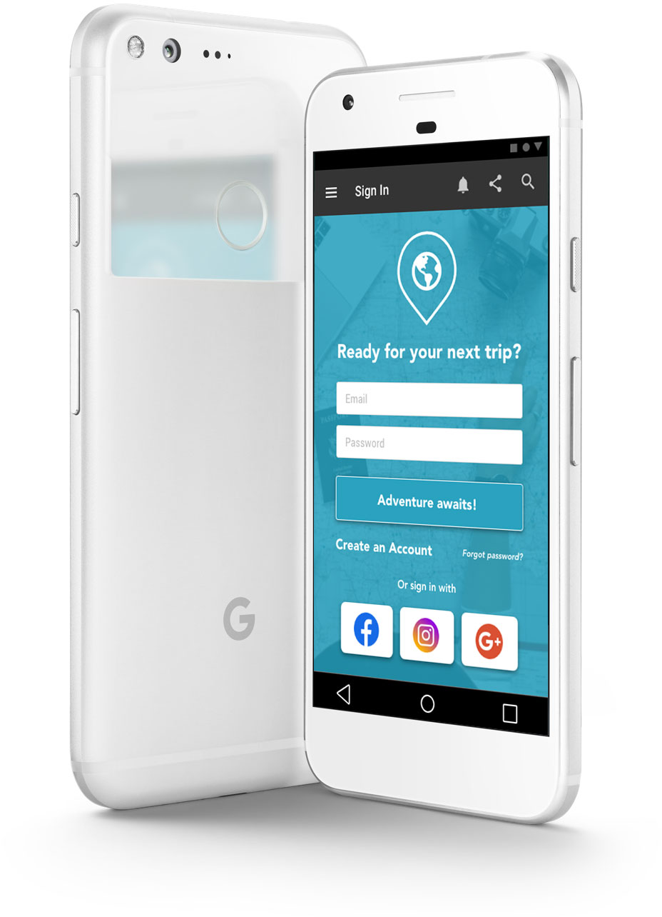
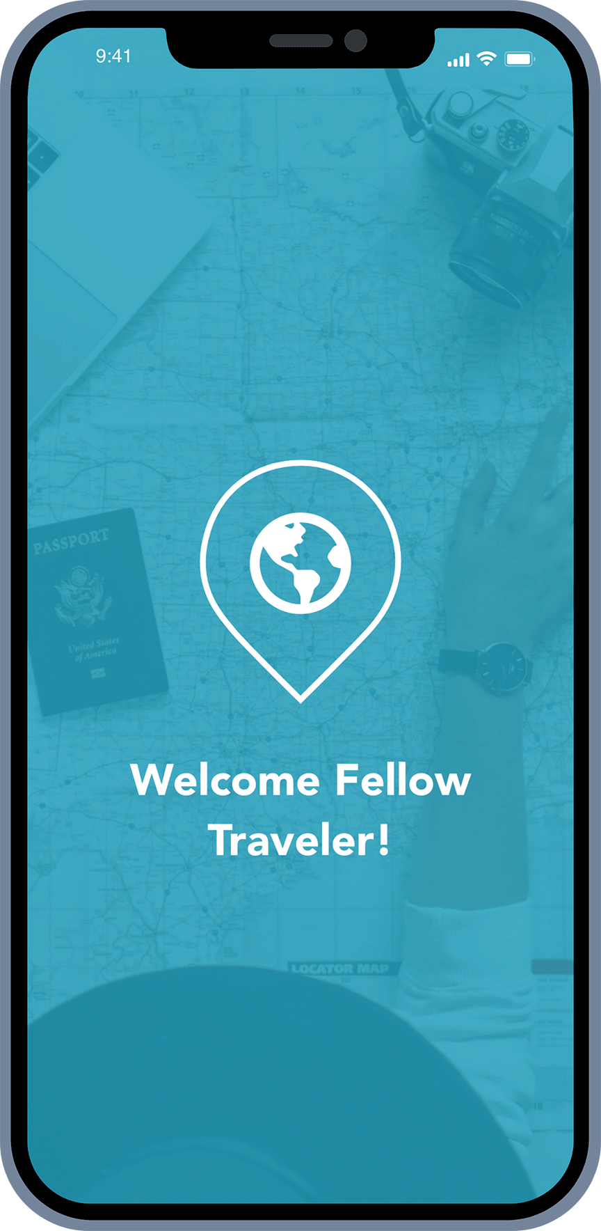
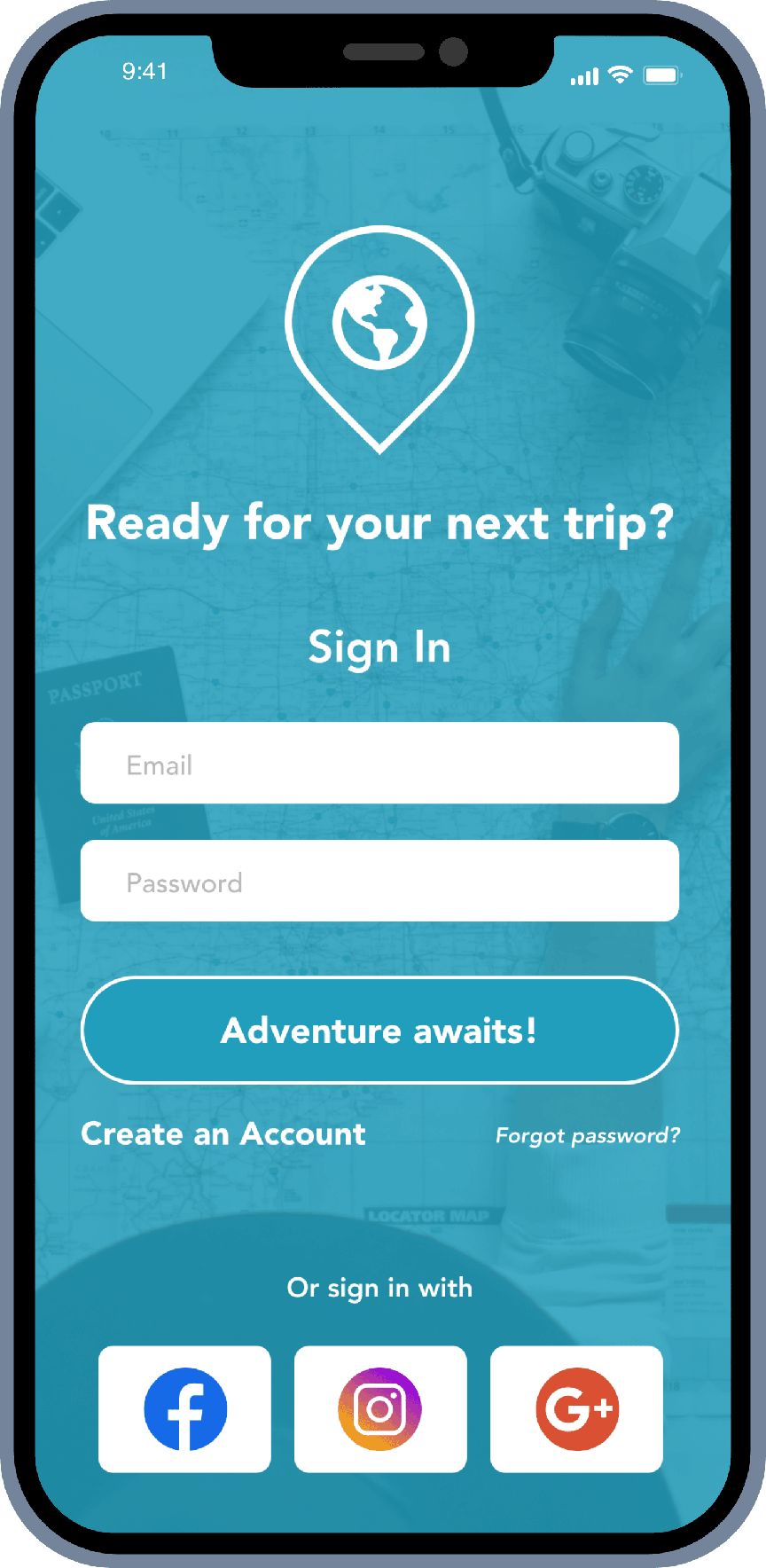
After opening the app the users see My Map’s logo with an easy sign in as well as the option to sign in with social platforms.
Create an Account
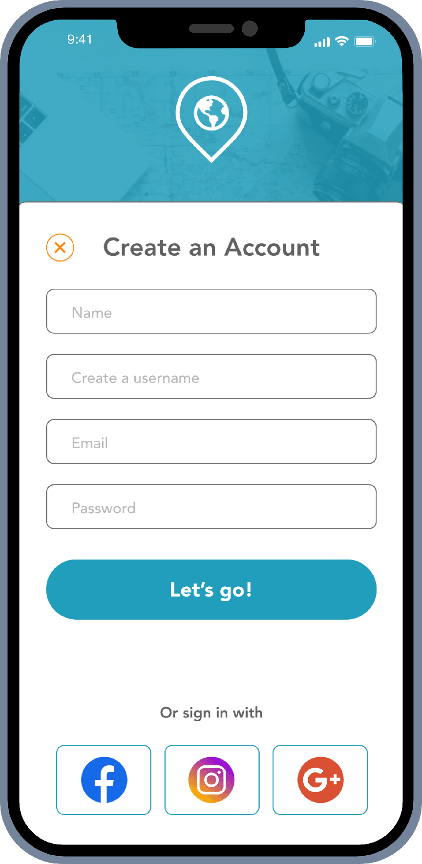
If users don’t have an account, they can create one with again the option to go through social platforms and create a fun username!
Final Designs
After reviewing over ideas and gaining momentum from inspiration, the color palette, photos and icons were initiated to bring alive the next adventure! There were a few drafts and after testing, these presented high fidelity wireframes incorporate user feedback in order to become a better experience for the user.

Sign In
After opening the app the users see My Map’s logo with an easy sign in as well as the option to sign in with social platforms.

Create an Account
If users don’t have an account, they can create one with again the option to go through social platforms and create a fun username!

Optional Interests Screens
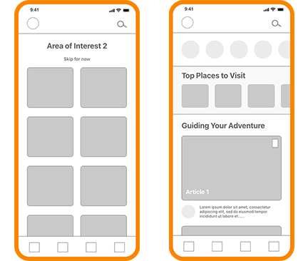
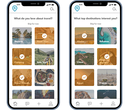
After creating an account, My Map leads the user to an optional question of interests in order to personalize the home screen with suggested places and people to follow.

Home
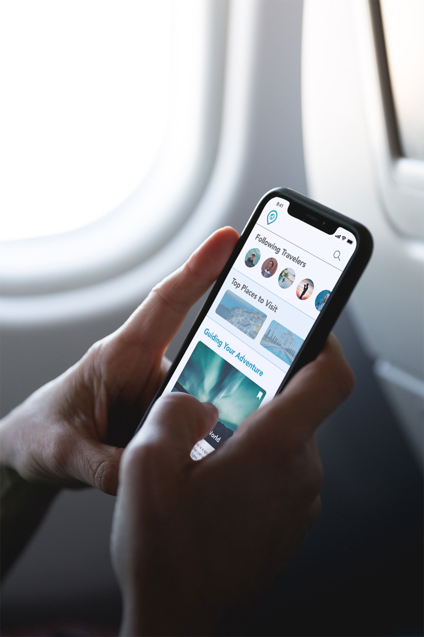
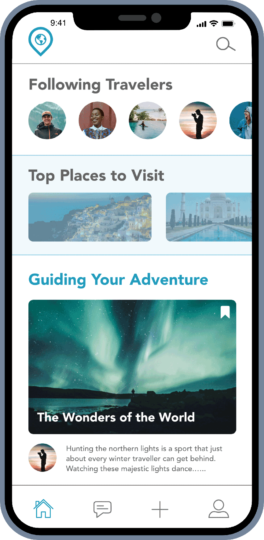
Follow friends or new travelers to get inspired by, see suggested places to visit and top guides that detail the user’s trip on what they want to share!

Optional Interests Screens
After creating an account, My Map leads the user to an optional question of interests in order to personalize the home screen with suggested places and people to follow.

Home
Follow friends or new travelers to get inspired by, see suggested places to visit and top guides that detail the user’s trip on what they want to share!
Create a Trip
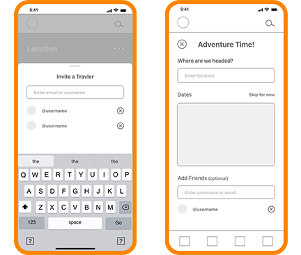
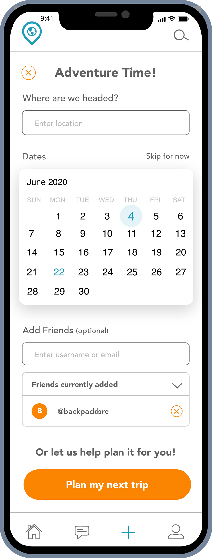
Have an idea in mind as to where you want to go? Type in the destination to get started. But, don’t know what dates yet? Users have the option to skip that until they are ready, along with whether they want to go solo or bring a mate! My Map will even help you with your next travel plans when you hit the ‘Plan my next trip’ button based on suggestions.

Profile
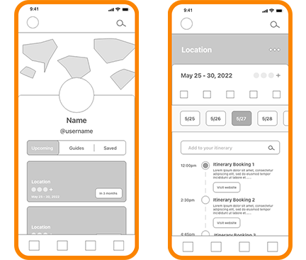
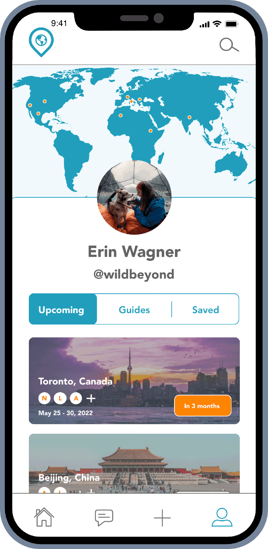
The user is able to add a profile photo with their chosen username and under be able to see upcoming trips, guides they created and saved from other travelers. The map above them is also pinpoints where they have been with a simple tap, opening the map to add an icon.

Profile
The user is able to add a profile photo with their chosen username and under be able to see upcoming trips, guides they created and saved from other travelers. The map above them is also pinpoints where they have been with a simple tap, opening the map to add an icon.
Add a Friend
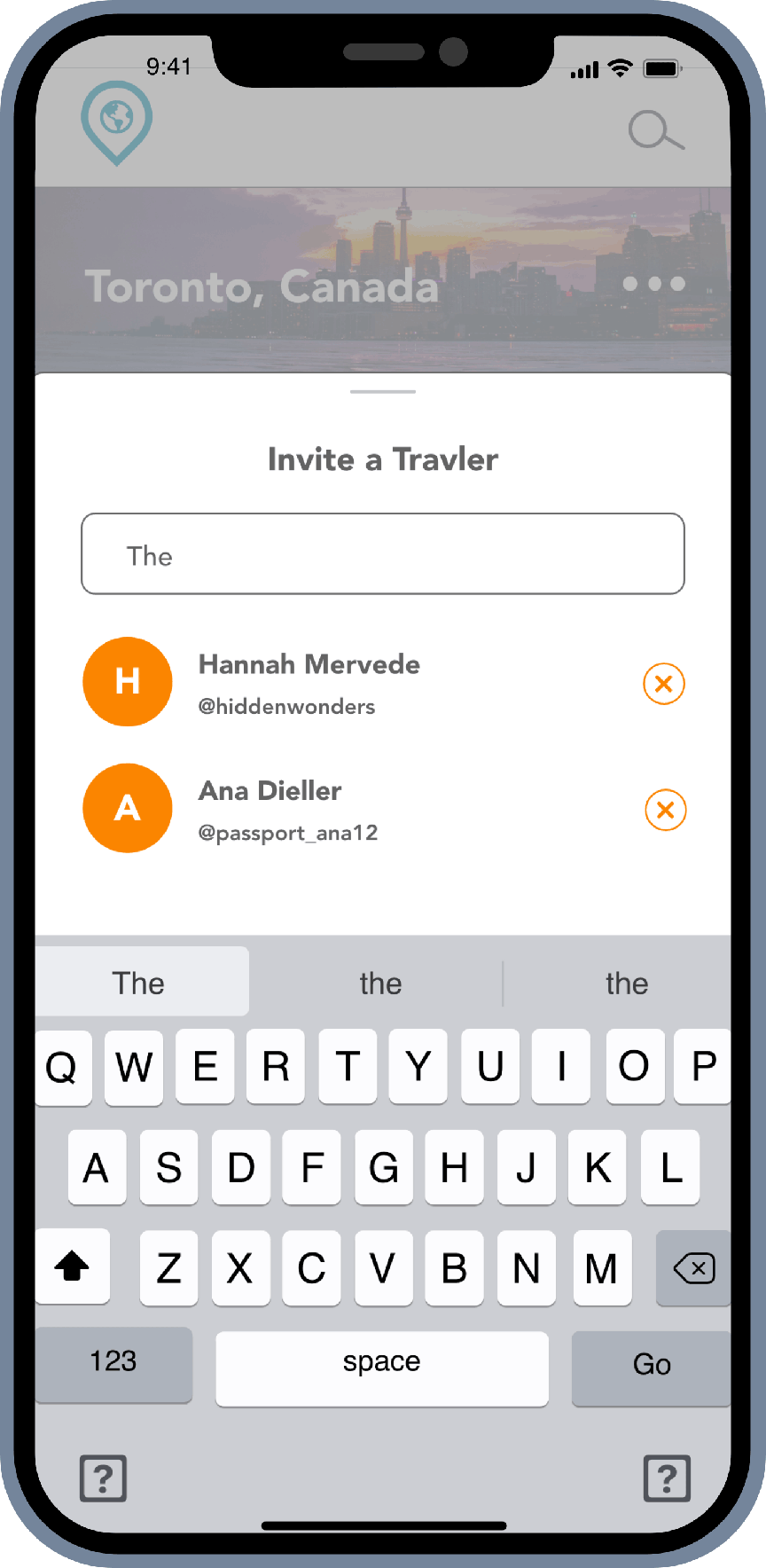
Add a friend in the ‘Create a Trip’ screen or have the option to add them right in the Trip Details page. Add them with their name or username, or be able to search through contacts to email them. Whoever is added to the page will be able to see everything laid out and add to the fun!
Trip Details
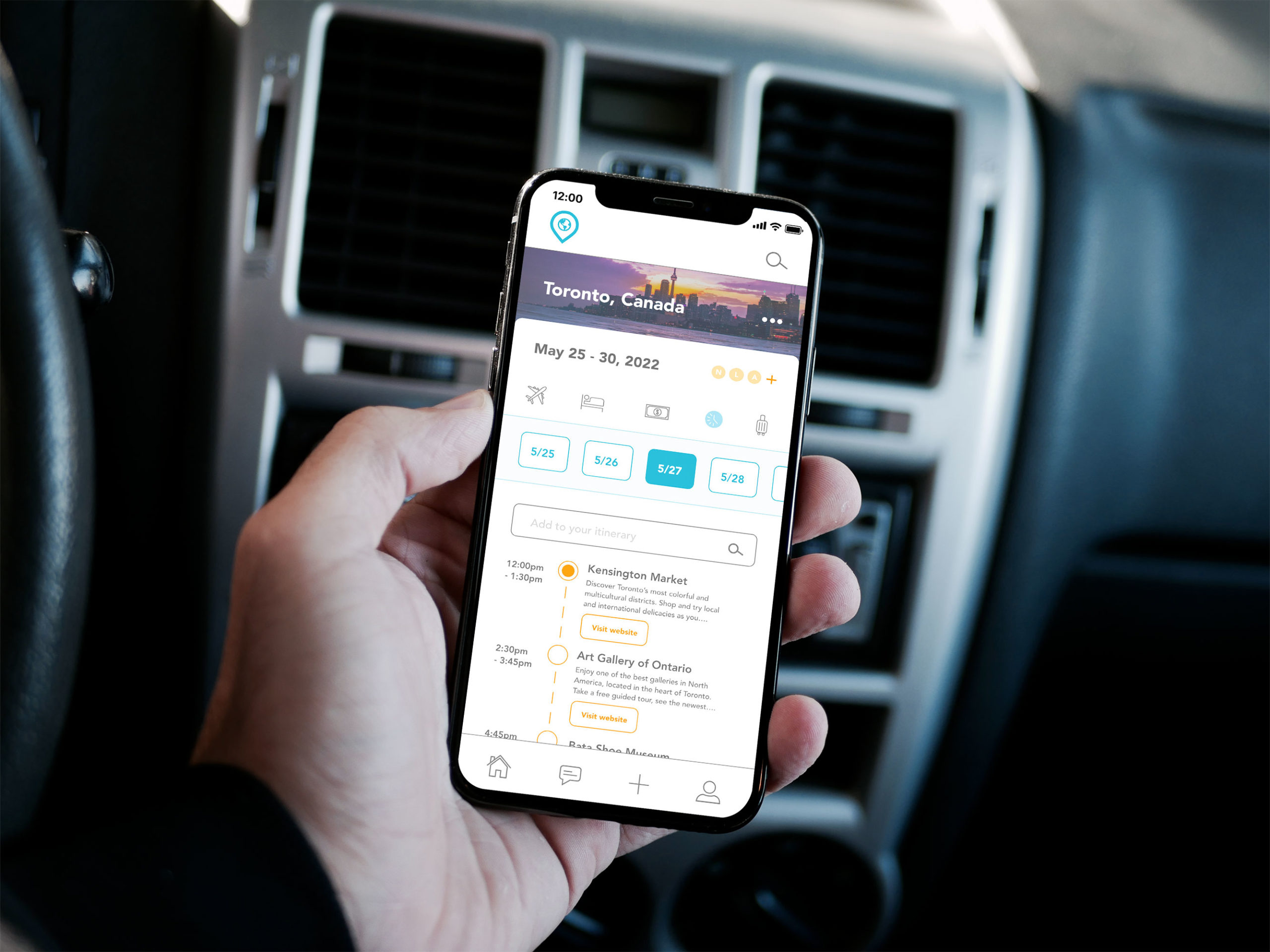
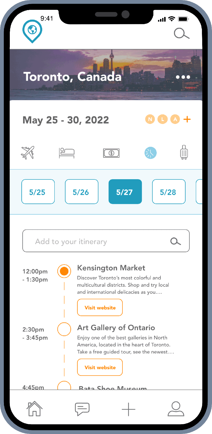
Get ready to start your journey as the trip details page is where everything is laid out. See where your next destination is, the date that is the trip and be able to add friends to the page. Add your transportation and lodging information, create a budget that you can split costs with another user, have an itinerary by each date and create a packing list so nothing is forgotten.

Add a Friend
Add a friend in the ‘Create a Trip’ screen or have the option to add them right in the Trip Details page. Add them with their name or username, or be able to search through contacts to email them. Whoever is added to the page will be able to see everything laid out and add to the fun!

Trip Details
Get ready to start your journey as the trip details page is where everything is laid out. See where your next destination is, the date that is the trip and be able to add friends to the page. Add your transportation and lodging information, create a budget that you can split costs with another user, have an itinerary by each date and create a packing list so nothing is forgotten.
Prototype
Once the high fidelity wireframes went through a few edits, they were ready for testing in order to observe and gain a better understanding of the user’s flow in person. The testing was done with InVision which allowed users to use the link given on their chosen device as if the app was live on their phone. Check out the iOS Version below!
User Feedback
The users were given the prototype on their choice of phone and overall the feedback was positive, but there were of course few changes to enhance future user experience.
Some Suggested Changes
“The initial options when starting are nice, but I would just change the second screen to say something like ‘which of these interest you’ because I don’t want to pick a destination right away, yet.”
Positive Feedback
Design Revisions
Through observing, testing and listening to feedback, I was able to understand any frustration points that needed to be corrected as well as what was working or what needed to be added. Designs were produced according to the users needs to make not only their experience in the app more pleasant, but to take the stress away from planning and bring back the excitement of exploring!
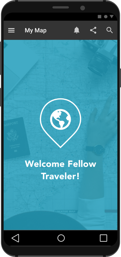
Check out the prototype version for Andriod users!
Final Takeaway
How did you meet the project brief?
The brief was open to interpreting your interests into an app, but required to be designed for both iOS and Android through following their guidelines.
What was your role in this project?
I was both the UI and UX designer gathering insights of other similar apps as well as going through the process of wireframes, testing and design while reviewing and having the guidelines for both devices be met.
If you could, what would you do differently?
What I could have done differently is after reviewing similar apps, ask two participants or one different than the mobile phone I have, to compare the two and what they liked or didn’t like based on the difference of the devices.
Did you have any roadblocks? If so, how did you overcome them?
In the beginning I had struggled to make sure to remember the different guideline and structure Material has compared to iOS because before I was only working with iOS apps. However, I took the time to analyze and take notes on similarities that could be kept in the app as well as highlighting the differences the two devices require for each of them.
Did you have to change direction at all? If so, why?
I did have to change direction on the design I was thinking for the home screen because my first thought was to have a map to show where the user has been on that screen. However, after engaging conversation with travel users, many were interested in having more recommended destinations and articles on travel tips or places other users have been, while still keeping the map somewhere for their records.
Overall thoughts:
I created this travel app because of my love for exploring the world and all it has to offer. My Map is something I am quite proud of for how it turned out, especially with a challenge to pertain the app to all types of users, including Android and iOS devices. But, everyone should have the chance to see what is out there and share their experience!
