Quick UI Design Project
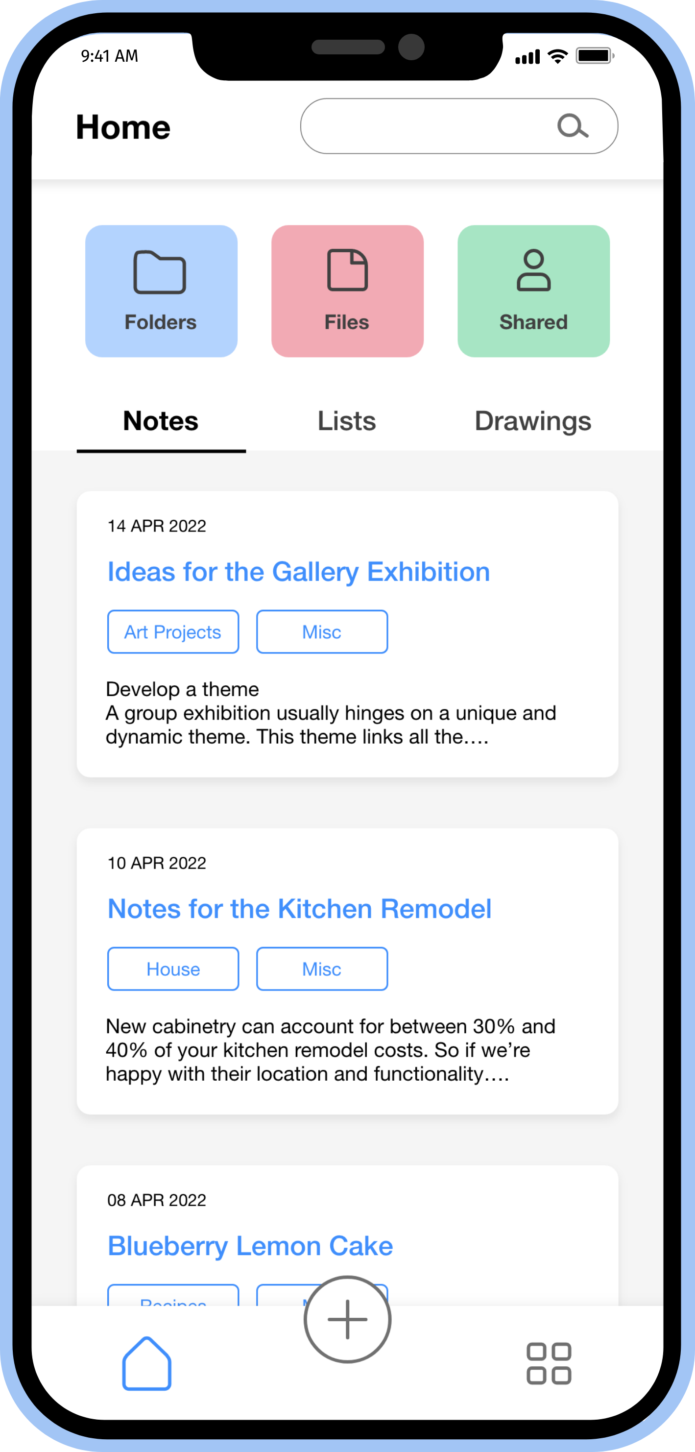
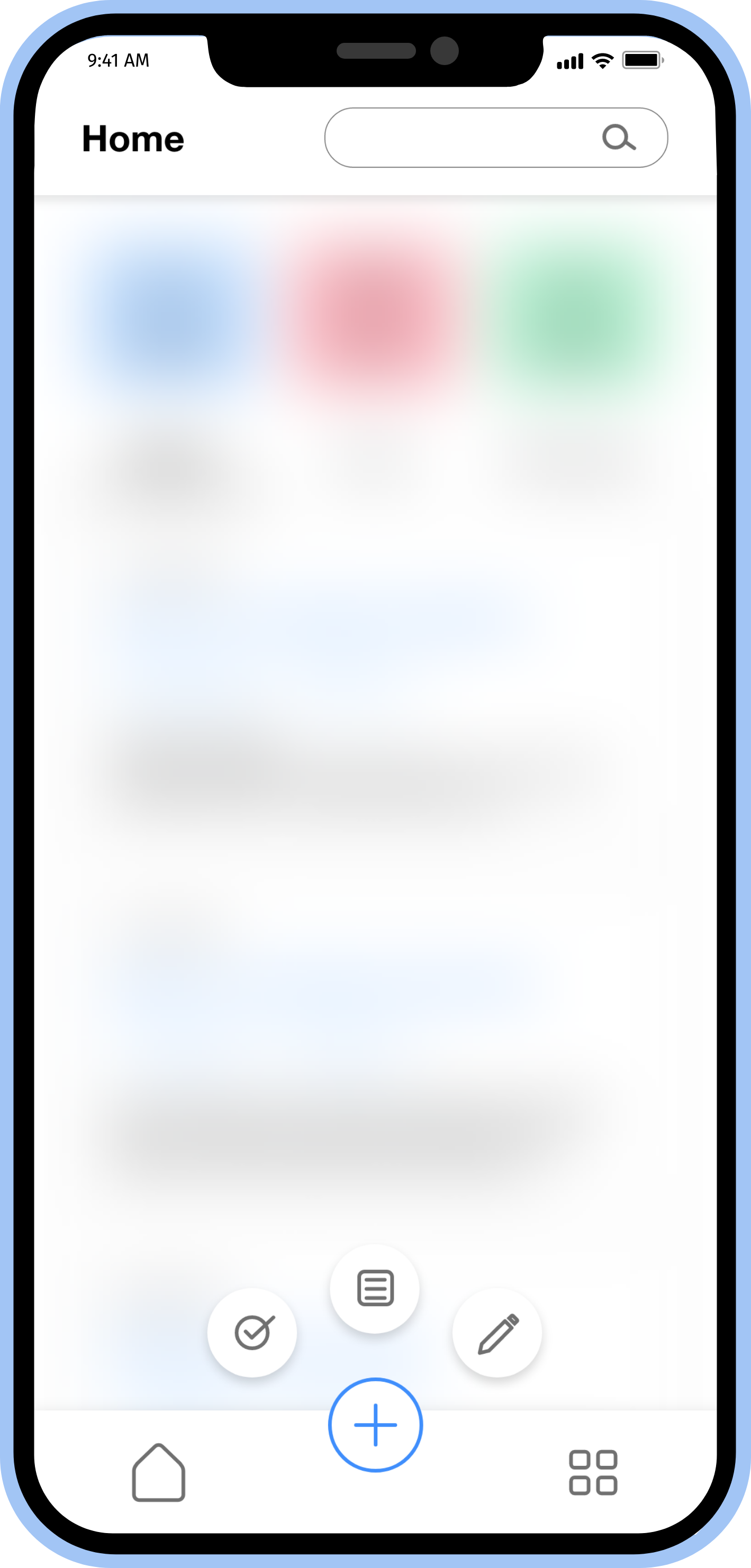
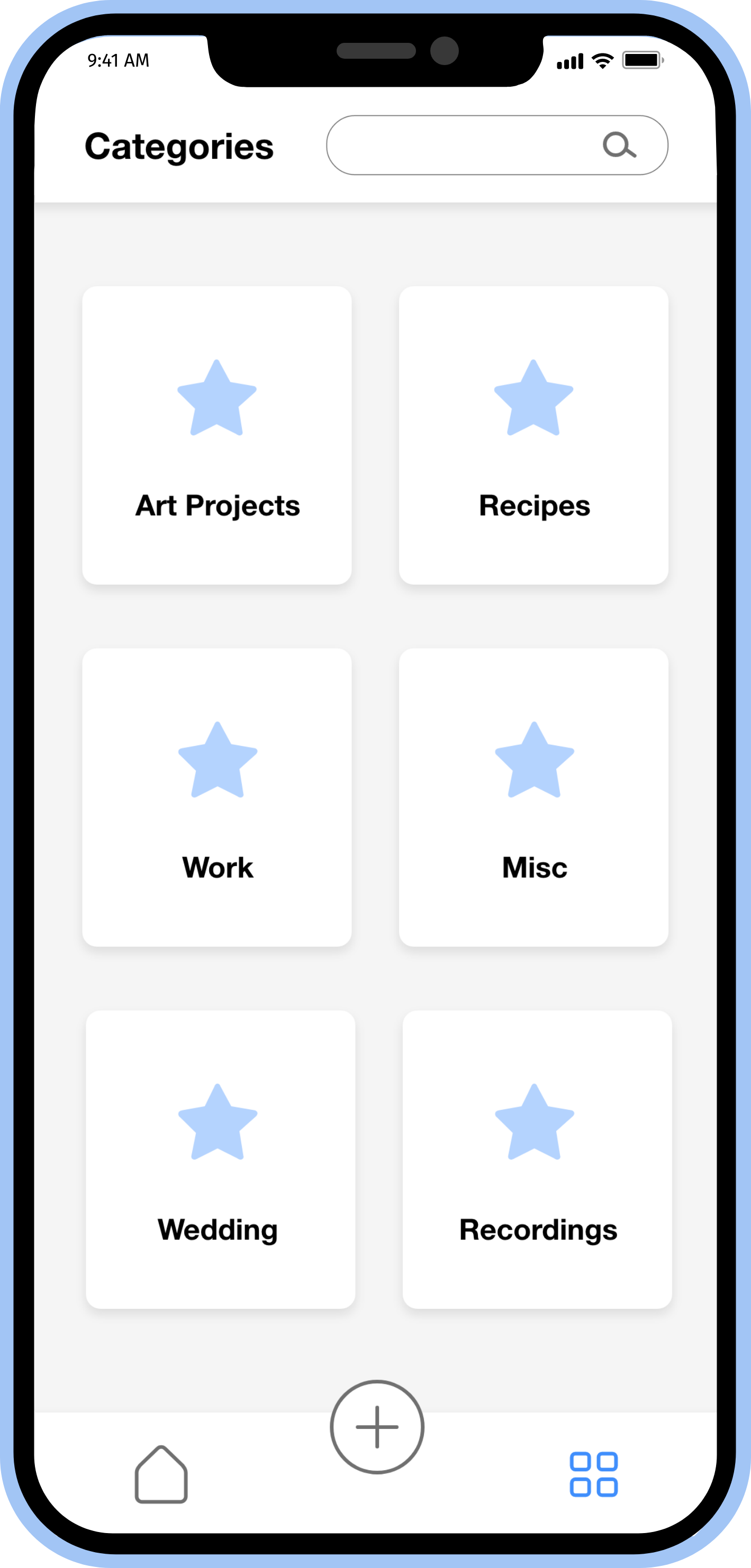
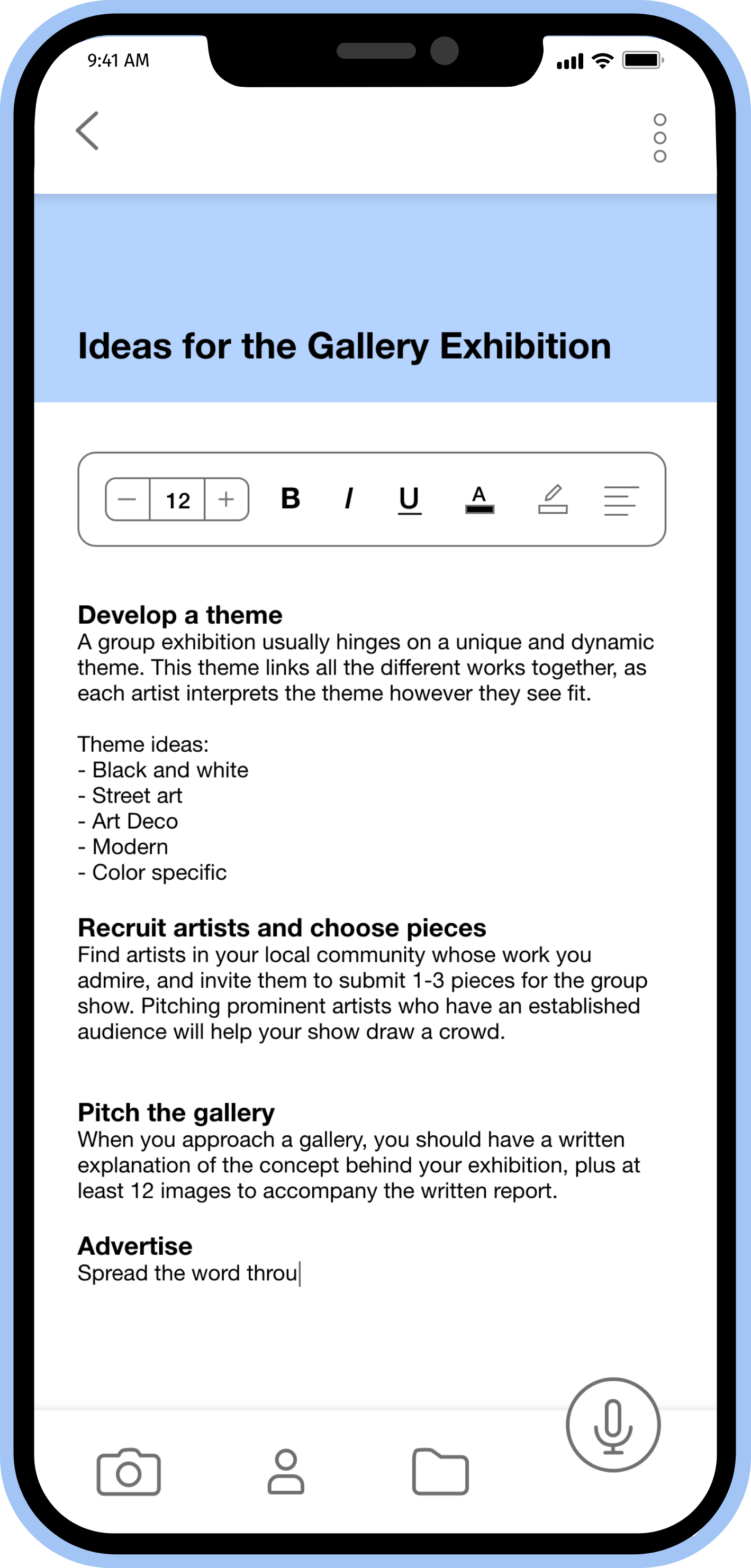
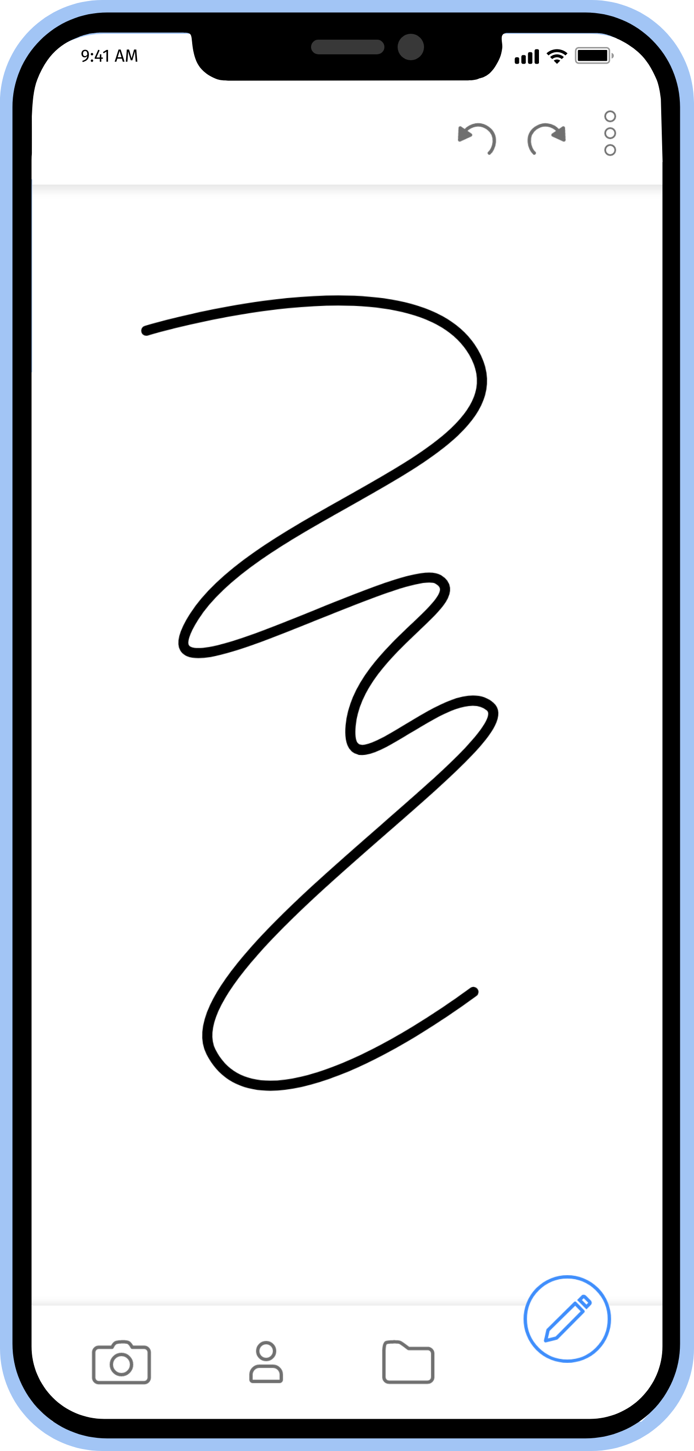
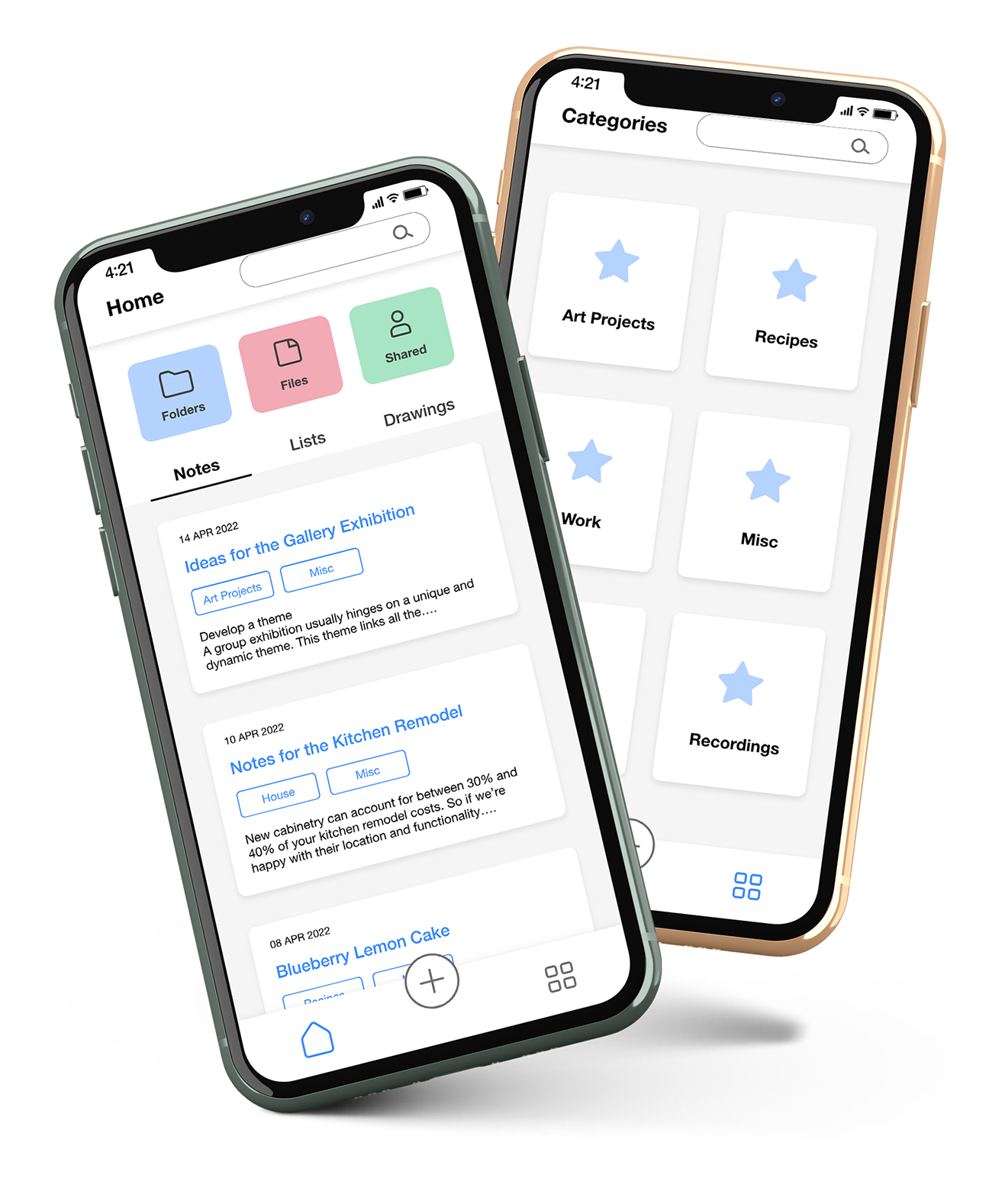
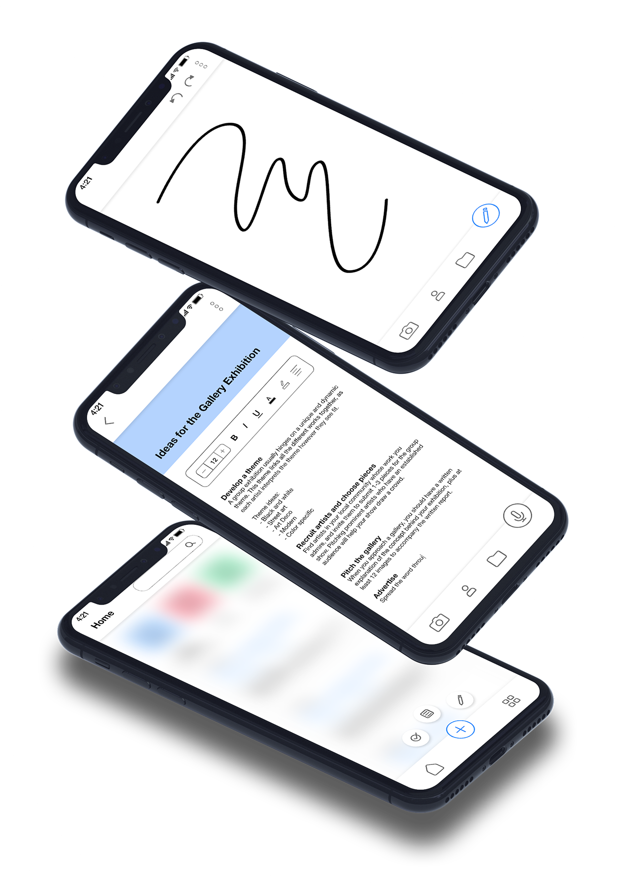
A new client has asked you to build a note-taking app à la “less, but better.” This client has not worked with a UI designer before, so they haven’t prepared any of the information you normally receive regarding UX deliverables, and since the request is urgent, you’ll need to work within this constraint. The client has requested that you deliver high-fidelity wireframes for 5 screens so they can pitch the concept to their investors. They expect your wireframes to be shaped by functionalism, meaning they are clean, simple, and that you design with “less is more” in mind.

Components
Color Palette
Typography
Helvetica Neue
Heading 1 | Bold, 20px
Heading 2 | Bold, 16px
Body Text
Lorem ipsum dolor sit amet, consectetur adipiscing elit, sed do eiusmod tempor incididunt ut labore et dolore magna aliqua. Ut enim ad minim veniam, quis nostrud exercitation ullamco laboris nisi ut aliquip ex ea commodo consequat.
Icons

Components
Color Palette
Typography
Icons
Helvetica Neue
Heading 1 | Bold, 20px
Heading 2 | Bold, 16px
Body Text
Lorem ipsum dolor sit amet, consectetur adipiscing elit, sed do eiusmod tempor incididunt ut labore et dolore magna aliqua. Ut enim ad minim veniam, quis nostrud exercitation ullamco laboris nisi ut aliquip ex ea commodo consequat.
Final Takeaway
This was a quick project that focuses on the phrase ‘less is more’ and creating something that utilizes white space to build balance. Although I kept the tone to be clean, I used a light shade of blue as the main color to be calming and simple with secondary light red and green colors. I also wanted to keep the icons similar with readable and have the typography a broad range within the family to change from extra bold to light. This was a fun challenge on designing in a sprint when a client brings up a project on a tight deadline or budget. It gave me insights to focusing on what is a priority to meet the clients expectations as well as honing in on functionality and the beauty of minimalism.
