Design Process
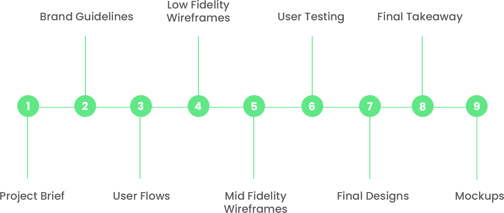
Project Brief
Objective
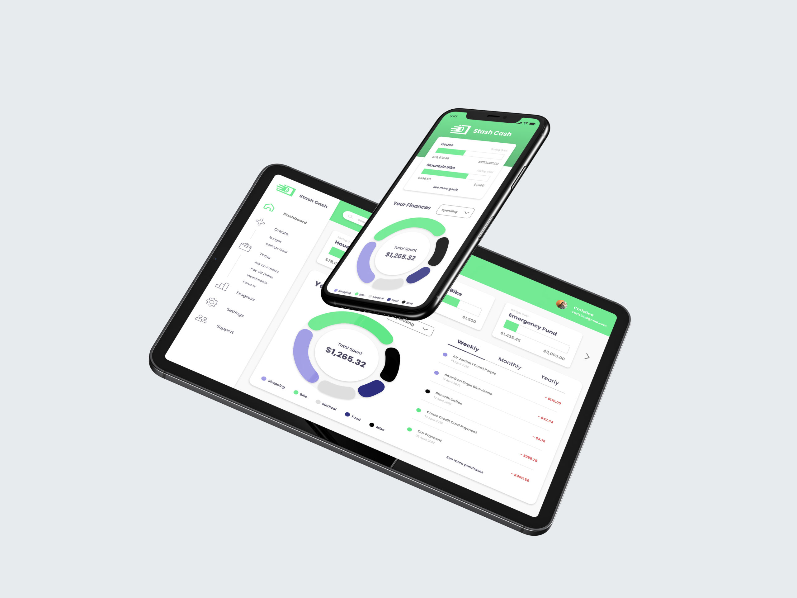
Ever wanted to have a better handle of your money? Or maybe a guidance on where your finances are leading? Stash Cash is a responsive web app that is made as a tool to help users save money for any occasion or a big expense in a short period of time. This app is simple to follow for users who may not completely understand how to improve their finances. Stash Cash can be used wherever and whenever the user is in need of cutting cost and growing their savings within a short timespan. If they know what they are looking to save for, Stash Cash can help plan accordingly on how to manage spending and accumulating money in order to achieve their financial goal.
Problem
Money saving can be difficult especially when you need to save quite a lot for bigger purchases. Many apps lack in guidance for users who are not as familiar with how to go about their finances and where to start with growing their income without becoming lost in expansive terms or complicated structure.
Solution
Stash Cash creates a simple platform for users to be comfortable with implementing their financial goals as well as learning steps on how to reach them through financial advice. Stash Cash makes it easy to save money without distractions so everything is transparent.

Brand Guidelines
Brand Description
Users will be inputting personal and financial information, so they will want to use a product they can trust. Just like you’d look for in a real financial advisor, the product should be considered reliable, serious, and build confidence in its users. We are largely appealing to those less familiar with the world of finance, so we must convey simplicity and clarity through our brand.
Key Messaging
“A finance app you can trust.”
“It’s like having a financial advisor in
your pocket!”
“Anyone can save money!”
“You don’t need to be a financial expert to use our app.”
Guiding Principles
Supportive:
Stash Cash is a place where users can go without any worry and be there for any assistance without judgement.
Approachable:
Stash Cash allows users to be comfortable engaging in the app without frustration and be simple to know where their money is going as well as clear information.
Reliable
The app knows there are ups and downs in life and things can get a little messy, therefore, Stash Cash puts users first so they can trust that their money is in responsible hands.
Key Messaging
“A finance app you can trust.”
“It’s like having a financial advisor in
your pocket!”
“Anyone can save money!”
“You don’t need to be a financial expert to use our app.”
Logo
The name Stash Cash refers to storing , while having the words rhythm to bring energy and fun to saving money. The logo itself is design to show a quick motion of the dollar bill with the intention of it being simple to recognize.
Primary
Secondary


Logo Only


Color Palette
The colors chosen for the brand is a brighter green to represent green as money and brighter to be attention grabbing. The darker gray and darker shade of blue tone down to balance the attention from the green.
Primary
RGB: 96, 231, 134
CMYK: 54, 0, 68, 0
RGB: 90, 87, 102
CMYK: 66,61, 44, 23
RGB: 72, 67, 92
CMYK: 74, 73, 42, 29
Secondary
RGB: 151, 146, 226
CMYK: 42, 42, 0, 0
RGB: 237, 255, 236
CMYK: 6, 0, 9, 0
Typography
The typeface used is called Poppins which brings a simple and companionable aspect to be open and less intimidating to users so they feel welcome.
Typeface: Poppins
Aa
Heading Bold
Body Text
Lorem ipsum dolor sit amet, consectetur adipiscing elit, sed do eiusmod tempor incididunt ut labore et dolore magna aliqua. Quis ipsum suspendisse ultrices gravida. Risus commodo viverra maecenas accumsan lacus vel facilisis.
Writing Style
Stash Cash is for users who are unfamiliar with how to go about their finances and want to learn what they can do to further their future. Therefore, the language should be easy to understand and no financial terminology that is not spoken in common conversation, but keeping a professional aspect.
Illustrations
Illustrations are used for Stash Cash to help bring playfulness and grab users attention when needed. The illustrations should stick to the color palette and simple flat design.

User Flows
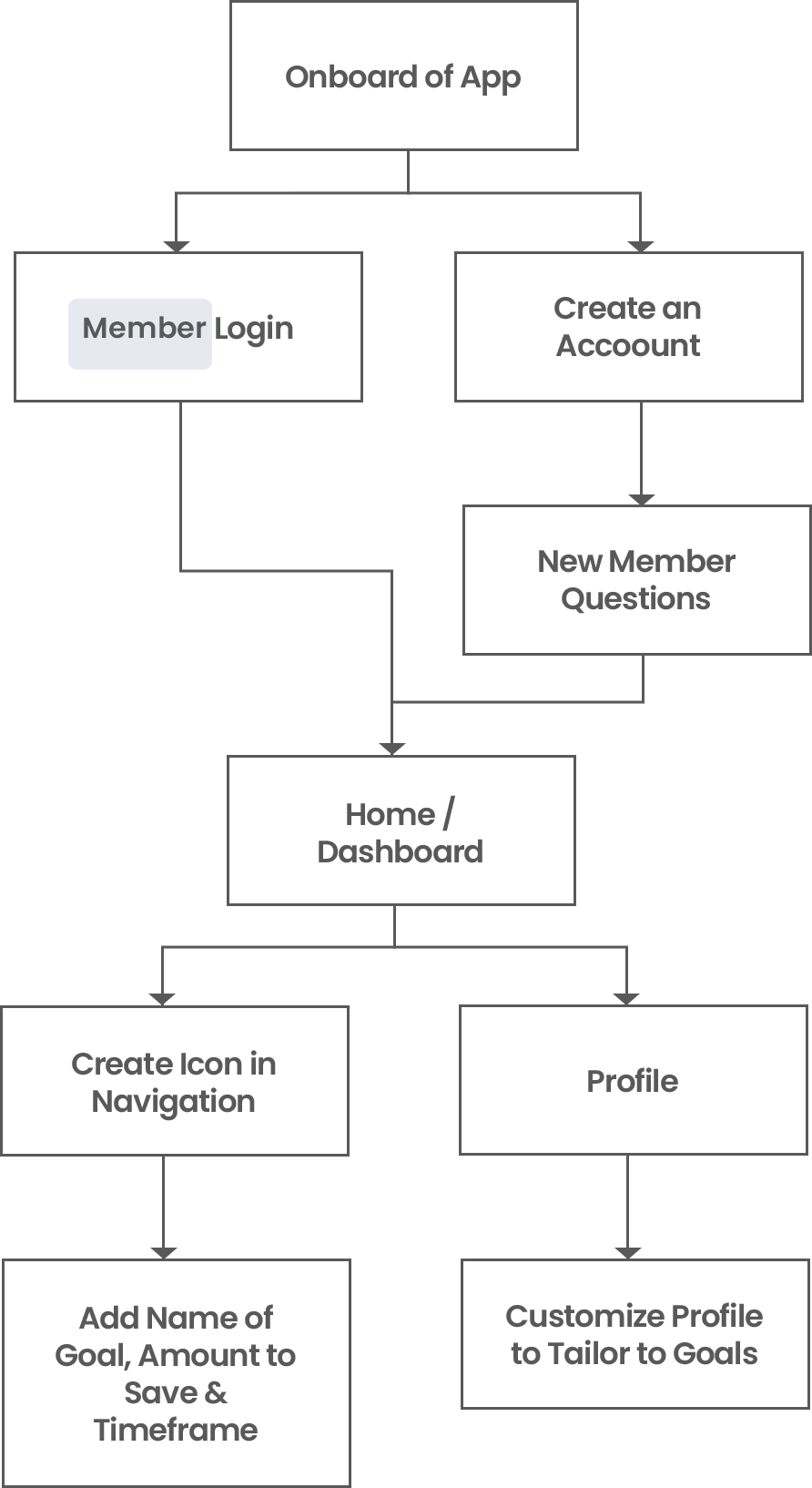
User Flow Selected for Wireframes
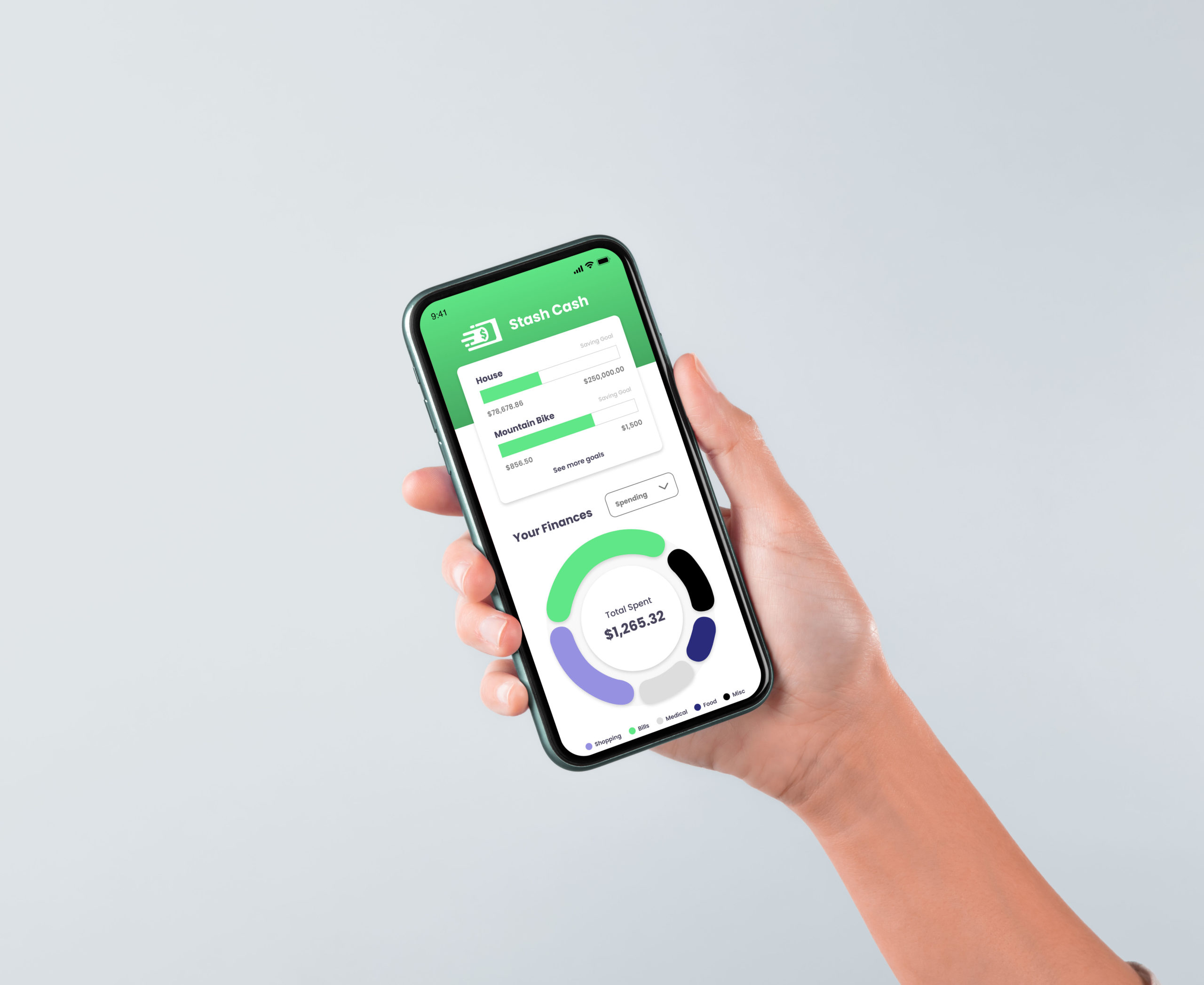
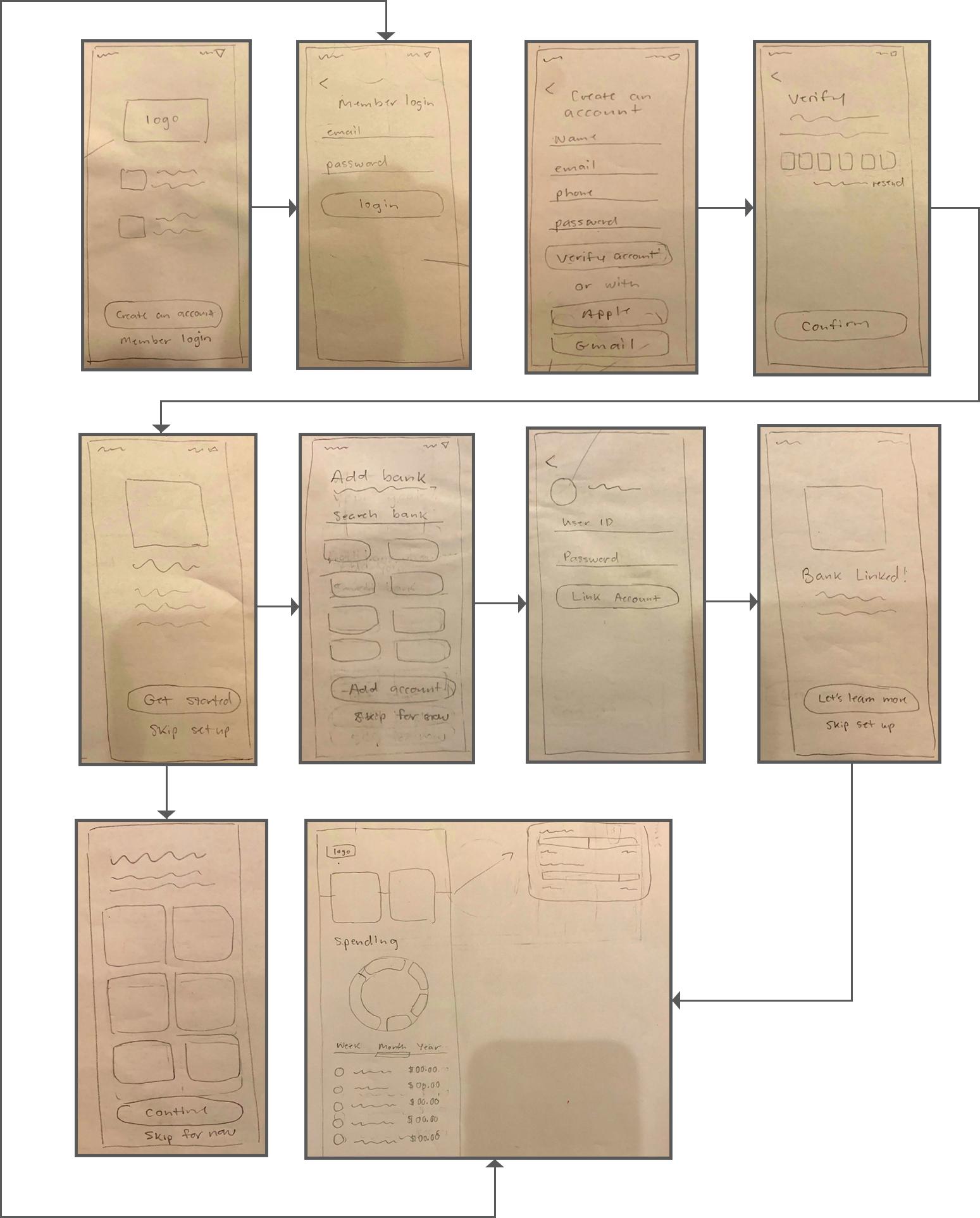
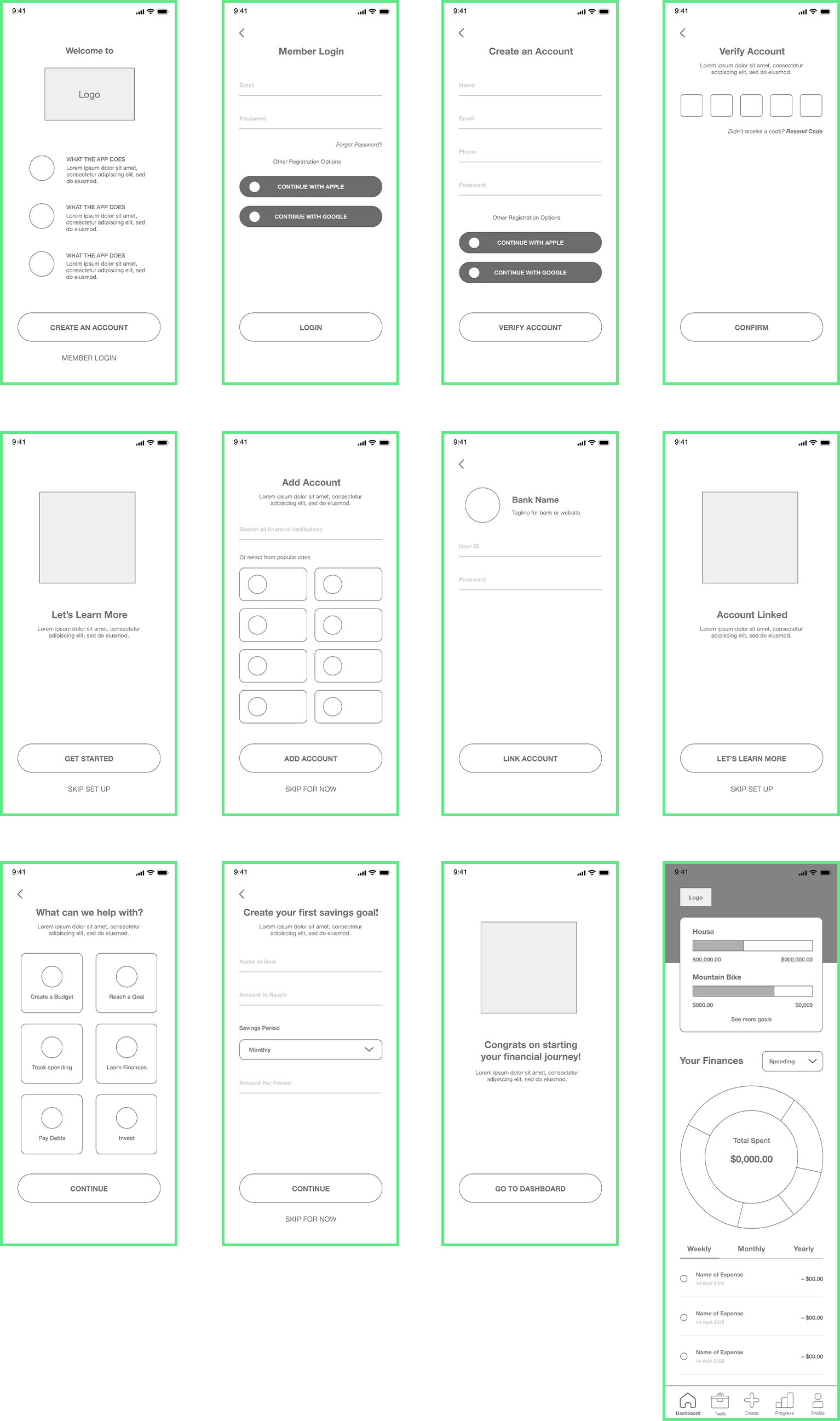
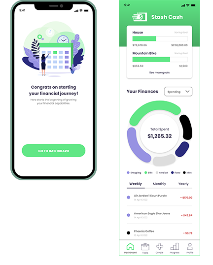
“As a user, I want to see a dashboard of my finances clearly and visually, so that I can see how much I am spending on what at a glance.”
Low Fidelity Wireframes
Mid Fidelity Wireframes
User Testing

Participant #1
- “It is a little confusing about inputting the amount you would save under the Savings Period- Monthly, and would be nice if the app could automate that to show what I need to save each month or period I choose.”
- “Overall understand everything and it’s simple. I like the circle that tells me what I am spending.”

Participant #2
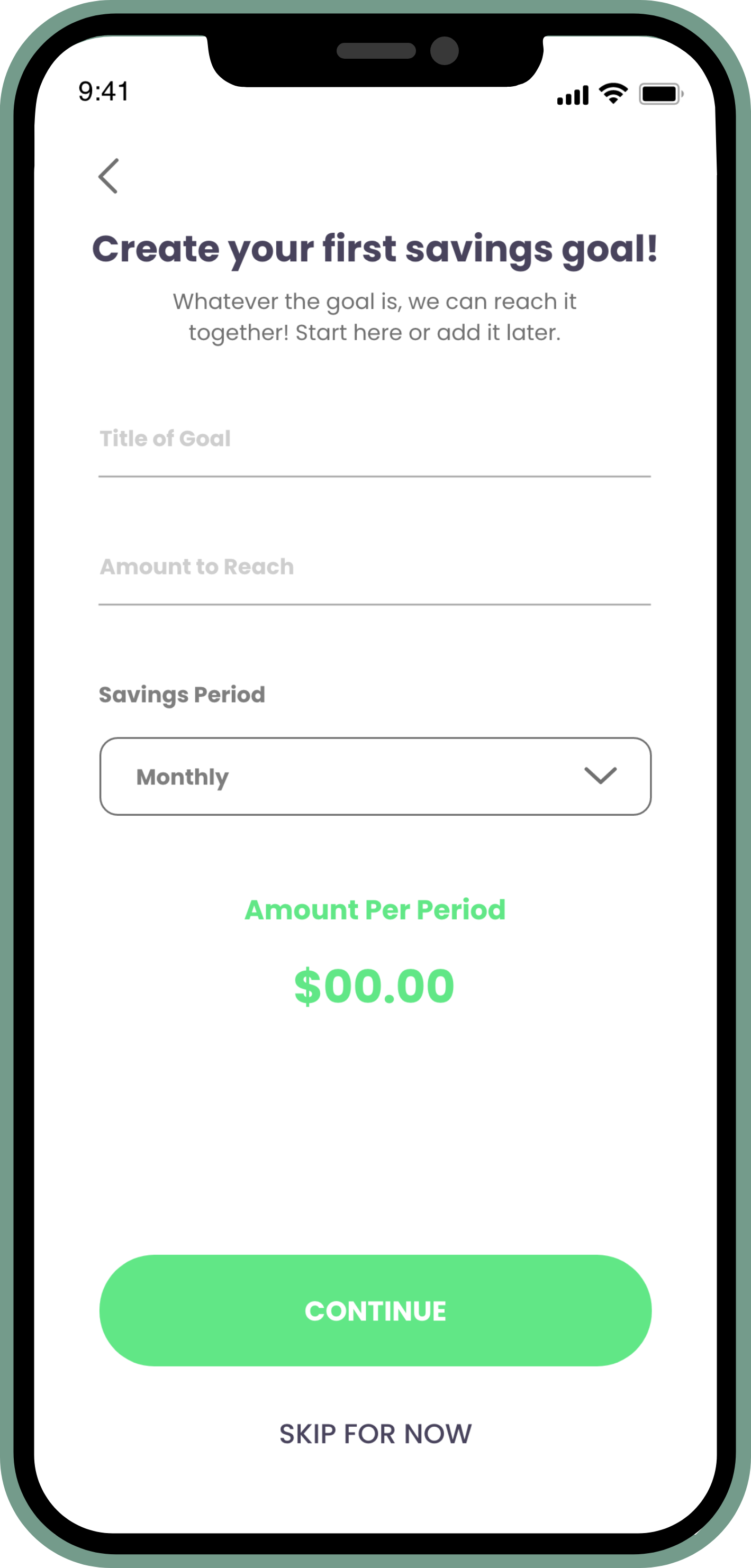
- “ The ‘Name of Goal’ I didn’t understand till you told me, but maybe just in case having it change to something else to know what you are saving for or titling it.”
- “Everything makes sense and I like how clean and compartmentalize it is and like the visual circle.”

Participant #3
- “Instead of ‘Other Registration Options’ I would change it maybe to have a different wording. I feel like I don’t really see apps that say that for alternative ways to log in. Maybe having ‘log in with’ or ‘or log in with’.”
- “Looks good overall! Can’t wait to see the final result.”
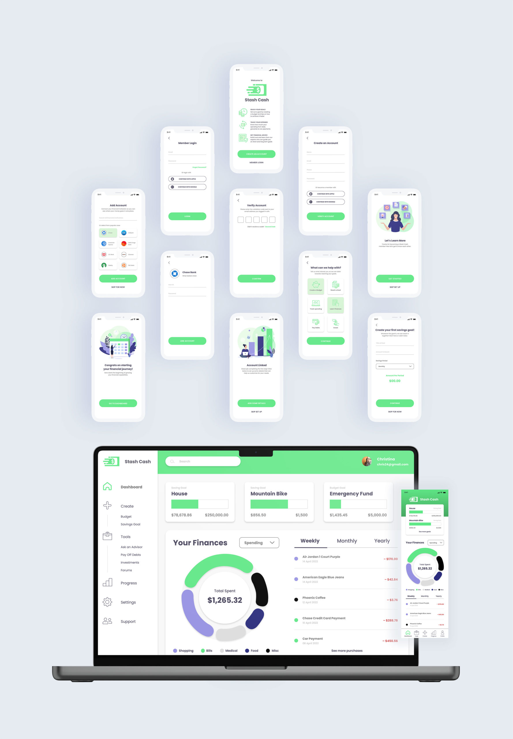
Final Designs
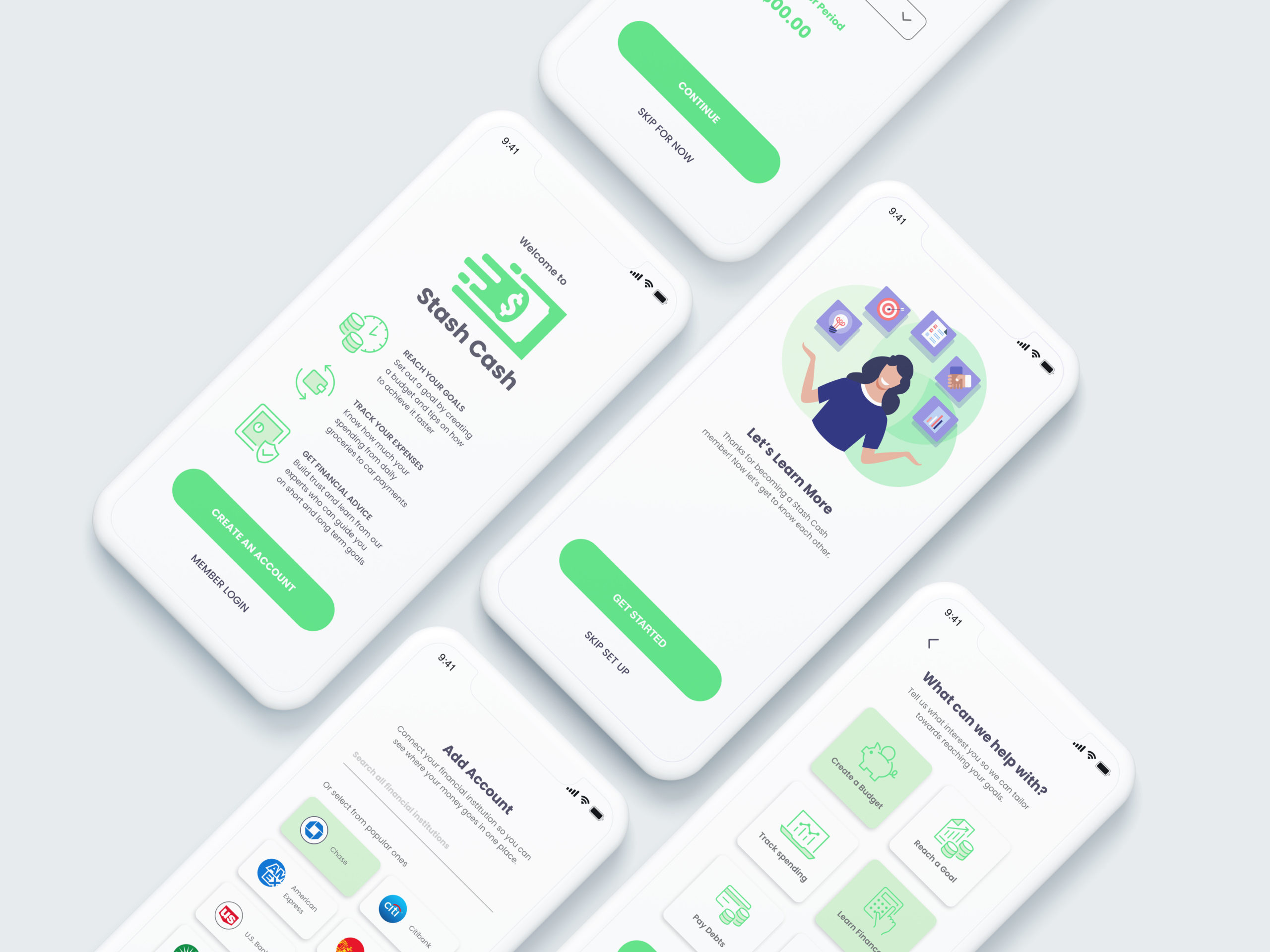
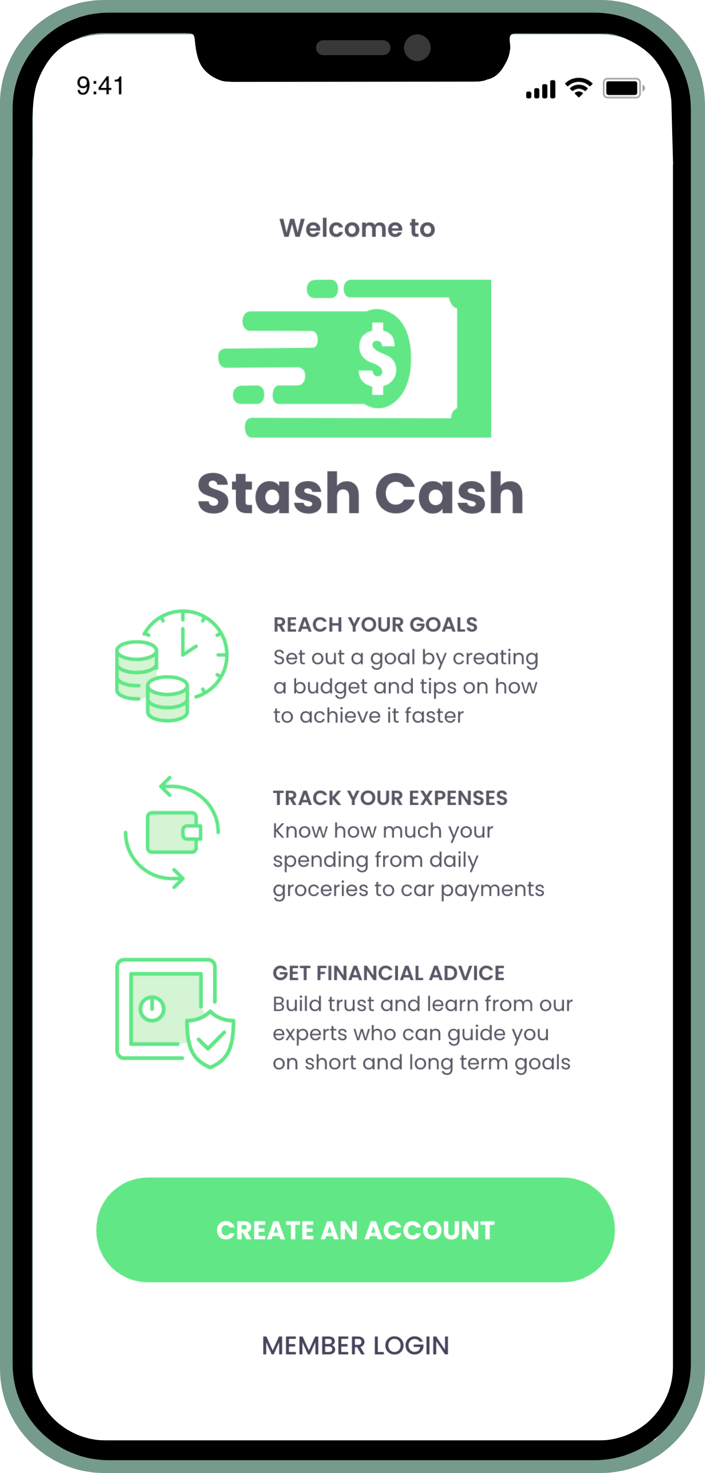
Onboarding
Member Login
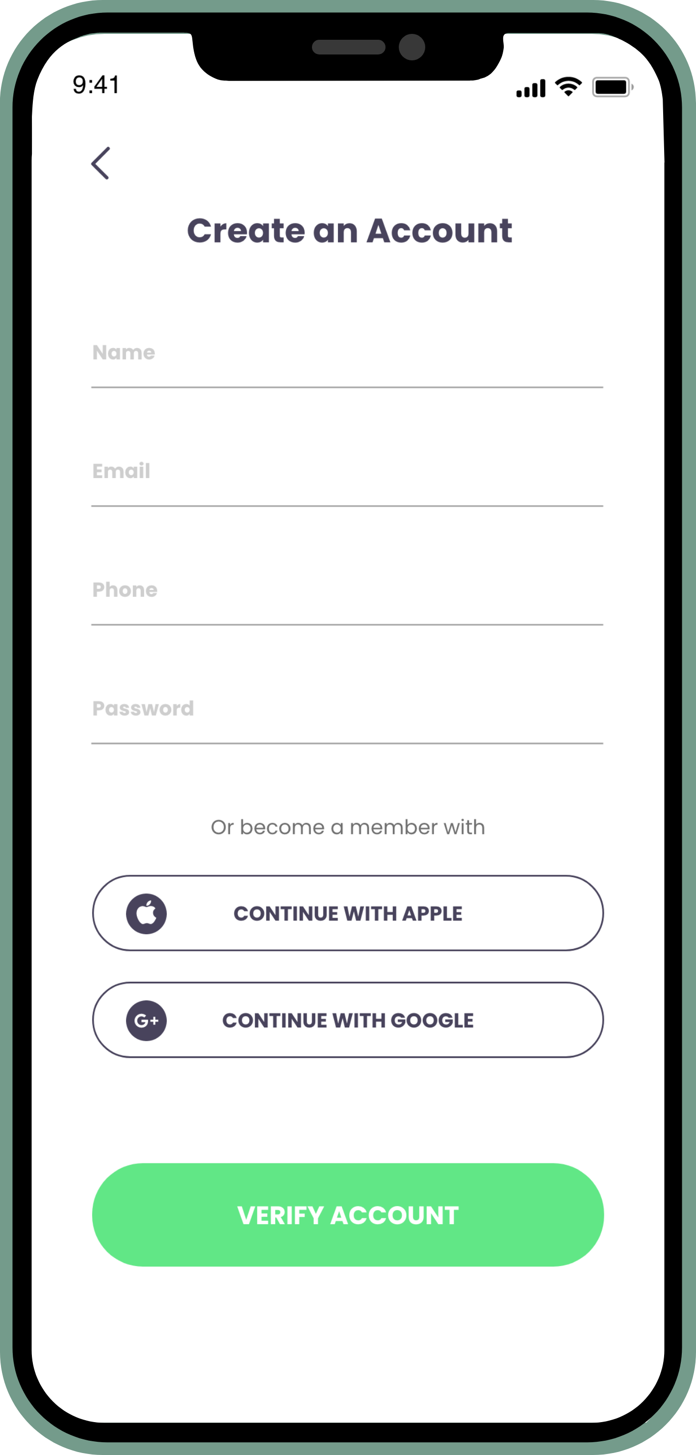
Create an Account

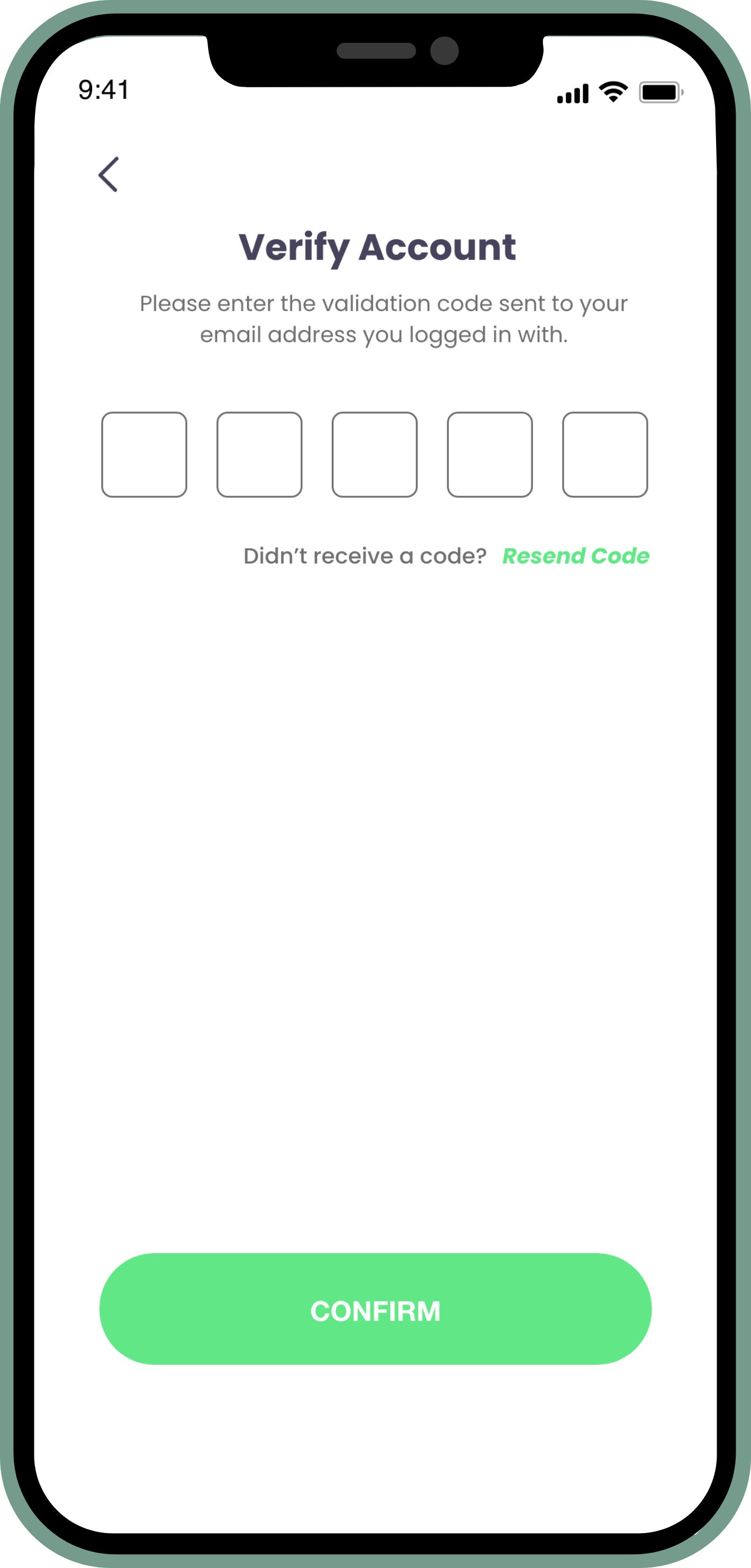
Verify
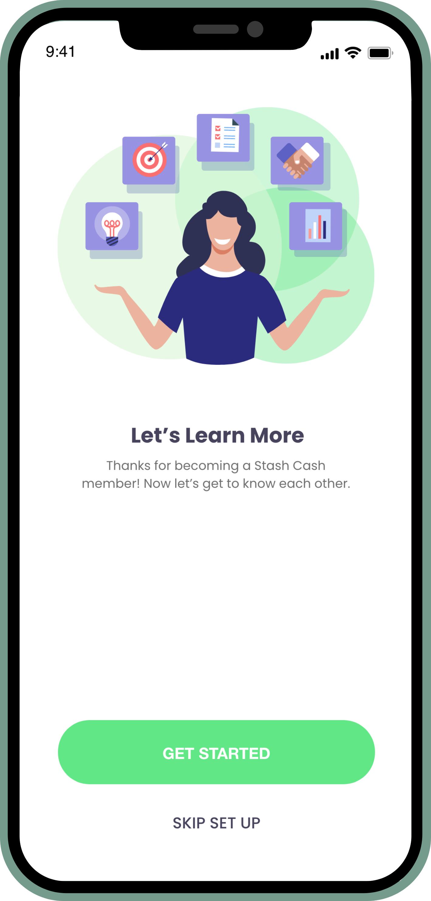
Get Started
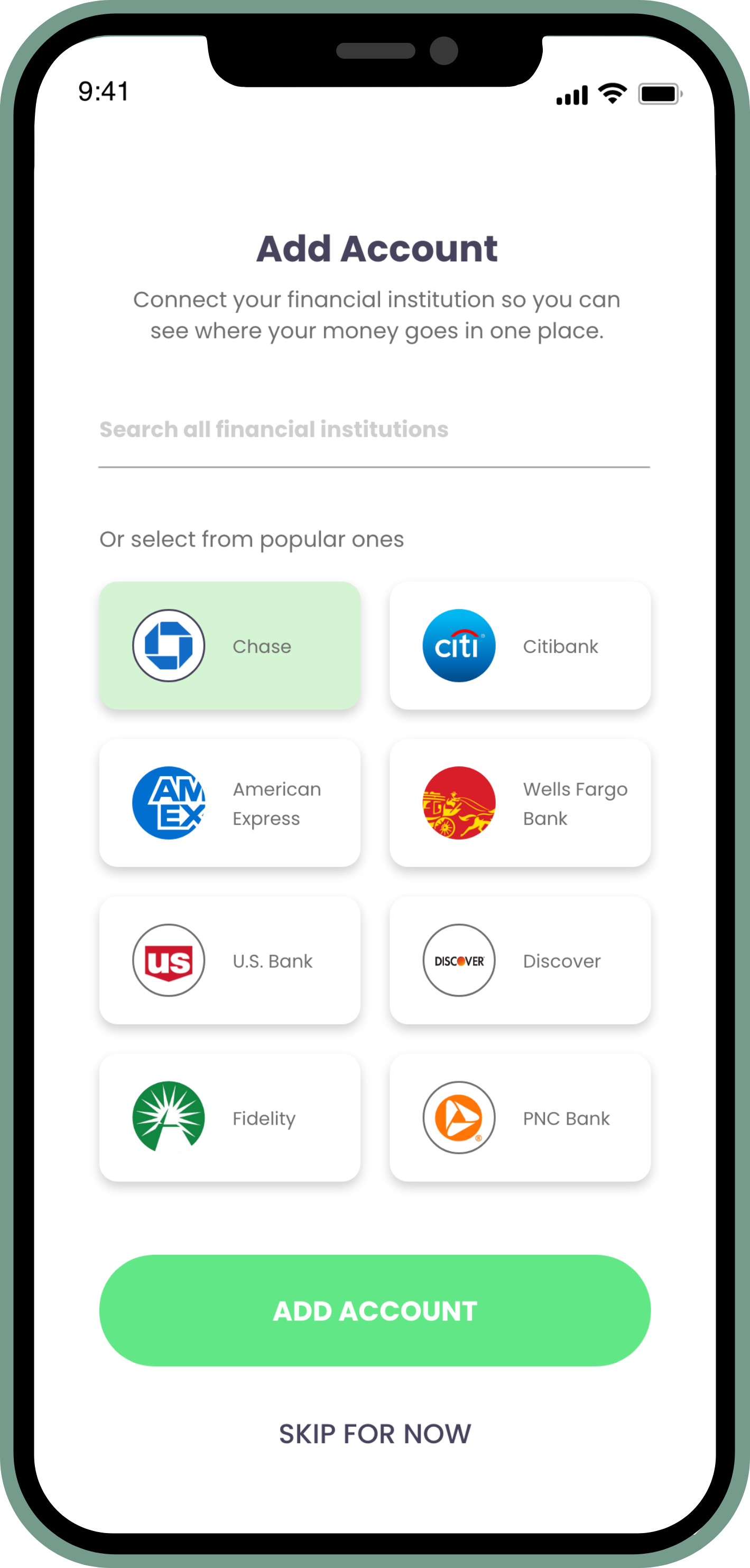
Add Bank
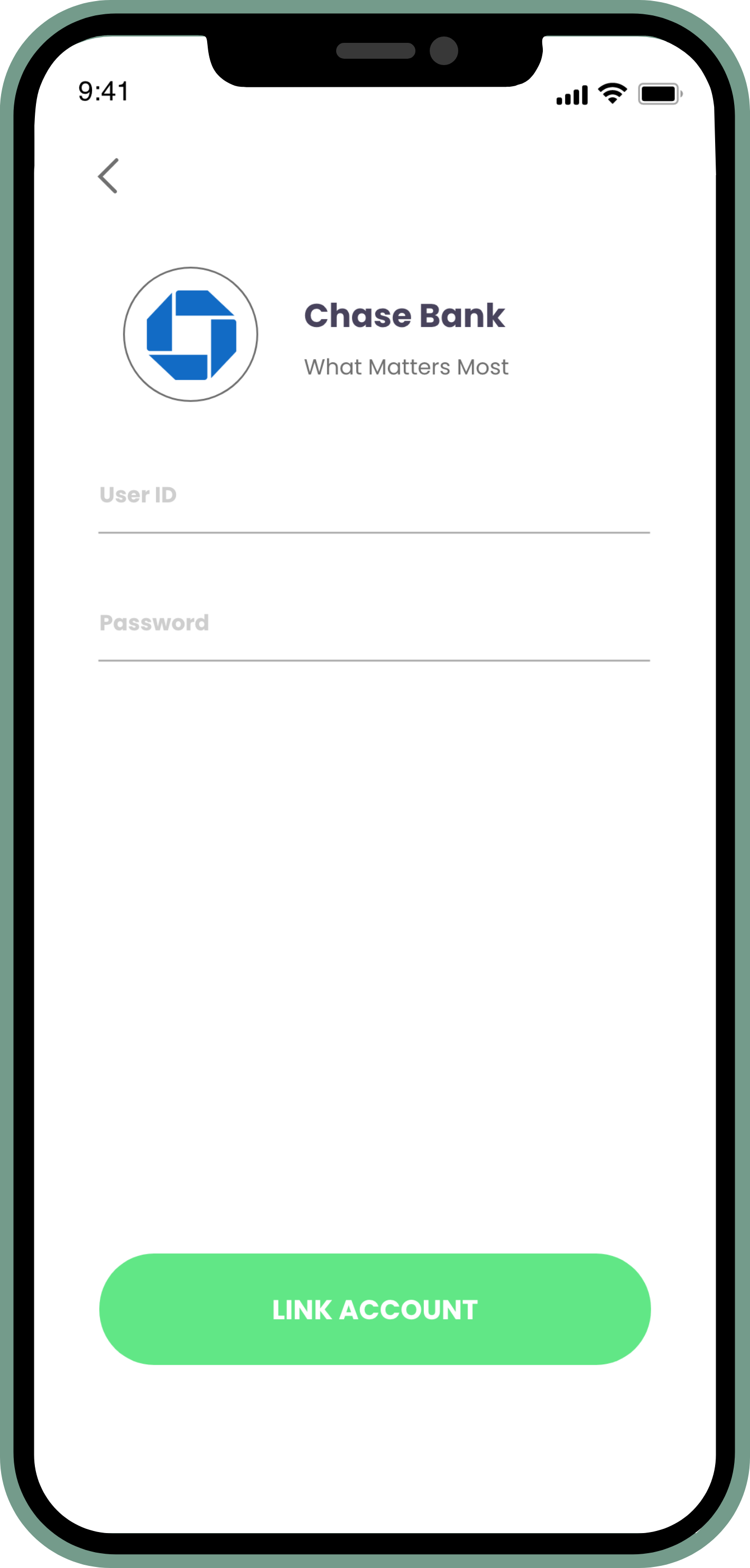
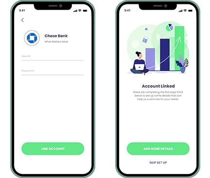
Link Bank Account
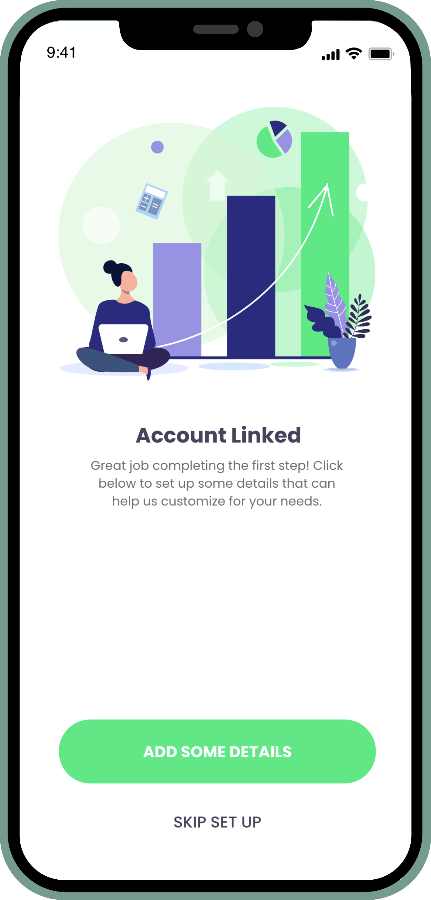
Account Linked
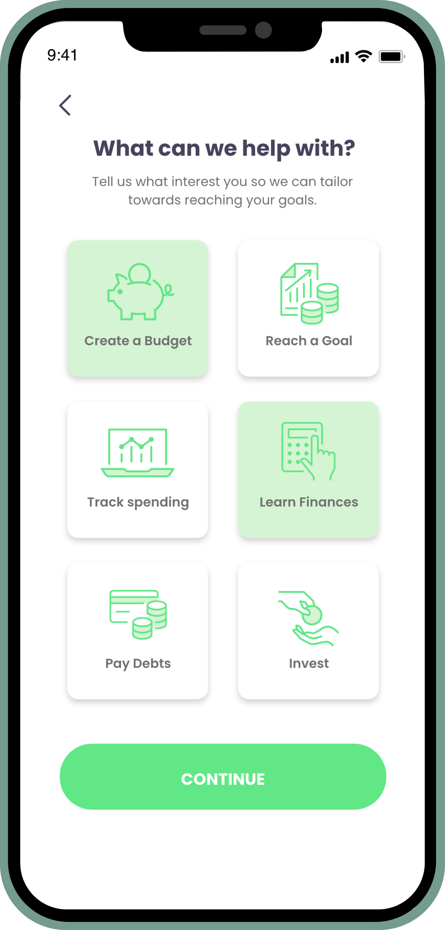
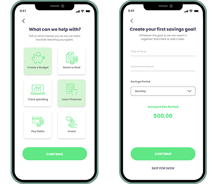
Interests
Savings Goal
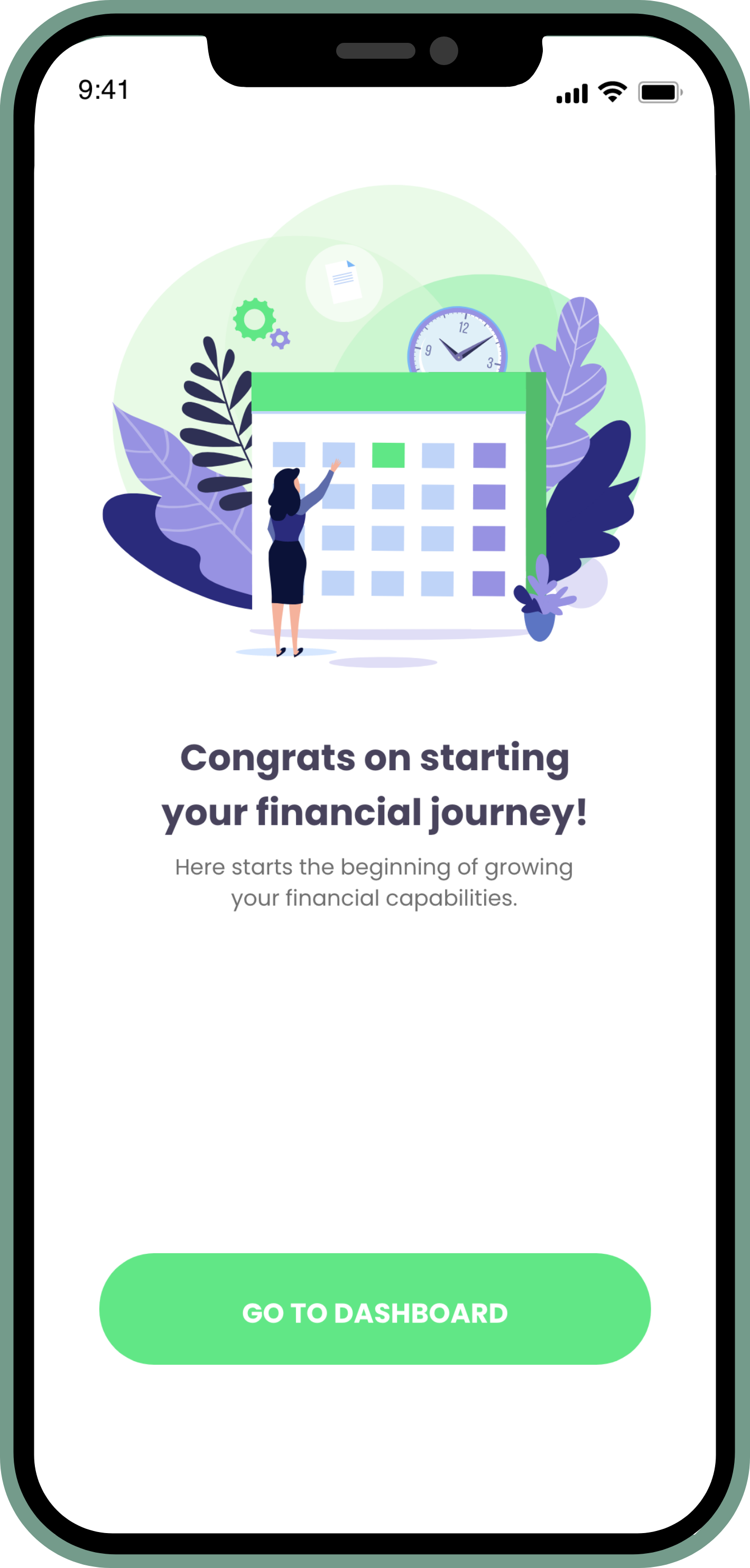
Congrats
Home / Dashboard

Desktop Version of Home / Dashboard
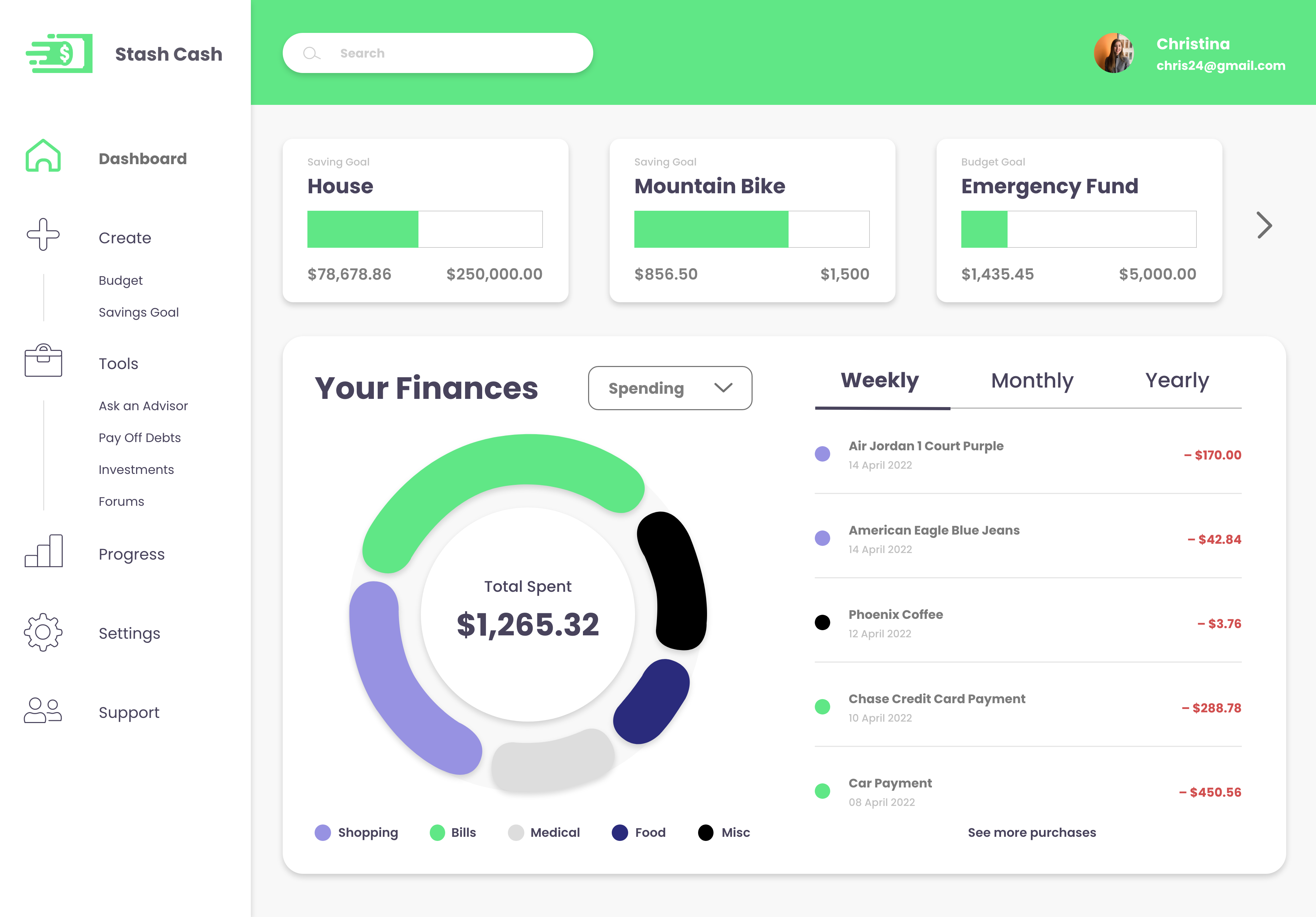
Final Designs
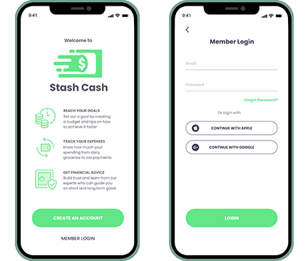
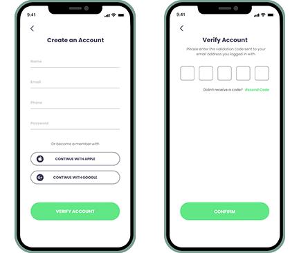
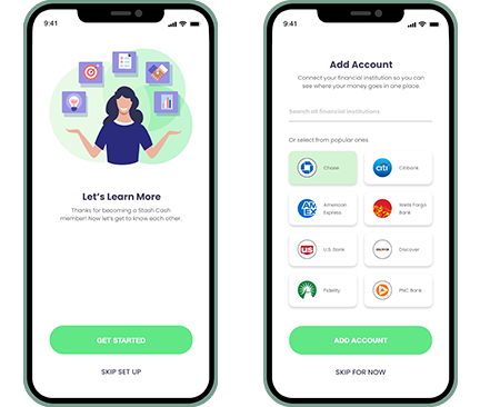
Desktop Version of Home
/ Dashboard

Final Takeaway
How did you meet the project brief?
I believe the brief was met because it was indicated to create something right away for users to be able to know how to save money quickly for a large purchase.
What was your role in this project?
I was both the UX and UI designer creating brand guidelines, gathering research and insights of other apps as well as going through the process of wireframes, testing and design.
If you could, what would you do differently?
I think what I would have done differently when starting this project and having more time is choosing a different user flow to create wireframes so that there were a few more screens such as a profile and creating a savings goal.
Did you have any roadblocks? If so, how did you overcome them?
One roadblock I can identify would be that I was going back and forth with the layout of the dashboard when sketching it out in paper wireframes and knowing the proper verification to have for a financial app without it being overwhelming to the user. I was able to overcome this through thorough research as well as reviewing over testing notes on how well the elements were laid out or what needed changes.
Did you have to change direction at all? If so, why?
Since this was a rapid project, I didn’t have much change in direction. There was apps that I was researching on the UI elements that would strengthen the financial app such as a verification code to provide trust and having optional goals to start with for new users.
Overall thoughts:
Overall with the rapid timeline, I believe Stash Cash works well with accomplishing the project brief and user flow chosen, while having a nice design that is simple and straightforward for users to trust with their finances as well as finding it easy to access or alter their savings goal.
